5/19 - 5/23 - Principle of Design - Repetition/Pattern
|
DUE SUNDAY May 24, 2020
Assignment Read the powerpoint to understand pattern. Download the worksheet, complete them, and share them to [email protected] |
| ||||
5/11 - 5/15 - Principle of Design - Proportion
|
Due Sunday May 17 at 11:59 pm
Assignment 1. Look for 3 poor examples of proportion from a media of your choosing. Explain why they are poor examples in your own words. Then suggest ways in which you would improve them. 2. Find 3 examples of exaggerated proportion and explain how it helps to visually communicate what the designer wanted. In your opinion, were they successful and why? Would you have changed anything? Include your findings and your examples on a google doc and share it to [email protected] 3. Complete the worksheet posted to the right and share it to [email protected] |
| ||||
05/04 - 05/08/20 - Principle of Design - Unity
|
Due Sunday, May10 pm 11:59pm
Why is Unity Important? If your design isn't unified, then it's disjointed. The ultimate goal in graphic design is to communicate a message so if you don't have strong unity in your design then the communication is hindered. No matter how beautiful your graphics are, if there's not some type of unity bringing them together then the design will ultimately fail in it's goal. Unity ties all the elements in your design together making it feel complete like each element in your design should belong there. You never want to have a design that has no real focus with elements placed randomly. You can think of unity in graphic design as a type of branding, something instantly recognizable. Companies often use color to unify every element of their business, whether it's for the logo, website or even in the store. Target is a great example of this because they use the color red for their website, logo, throughout their entire store and even the employee uniforms. The color red is the element that unifies the entire company together. Imagine if you walked into Target and everything in the store was green, you'd probably have to take a step back and make sure you walked into the right store, because you're so used to seeing Target as red. Assignment Read the powerpoint to understand unity. Download the worksheets, complete them, and share them to [email protected] |
| ||||||
05/04 - 05/08/20 - Principle of Design - Variety
|
Due Sunday, May10 pm 11:59pm
Variety is the principle of art that adds interest to an artwork. Variety works through juxtaposition and contrast. When an artist places different visual elements next to one another, he/she is using variety. Straight lines next to curvy lines add variety. Organic shapes among geometric shapes add variety. Bright colors next to dull colors add variety. Note: If an artist uses variety to draw the viewers attention to a specific area in a composition then variety morphs into emphasis, also a principle of art. Principles of art bleed into one another. They overlap. 
Kennard Lilly's website background uses a variety of colors and shapes to create interest, while also placing emphasis on the primary text content.
|
| ||||
04/28/20 - Principles of Design - Emphasis
|
If all the elements are given relatively equal weight, there will be no emphasis. You can lead that viewer all through your garden, through your building, through your advertisement, or through your painting, but if you don’t stop that viewer with one point of interest, then you’ve lost your viewer. The emphasis in a design is the message that you want to convey.
|
| ||||
04/28/20 - Principles of Design - Contrast
|
Due by Friday, May 1.
Interaction of contradictory elements. Expresses the duality seen in opposites. Without values, you can’t create contrast. Without smoothness or roughness (or the illusion of those textures), you aren’t dealing with contrast. You can use various design elements to create contrast. Without contrast there would be no day or night and without contrast you cannot create an interesting design. Examples: Large & Small, rough & smooth, thick & thin, light & dark, organic & geometric. Like it or not, we live in a world full of contrast. There are differences between tall and short, black and white, young and old, female and male, living and dead, organized and chaos, hard and soft, sky and ground, good and evil and so on. |
| ||||
04/20/20 - Principles of Design - Balance
|
Due by Friday, April 24.
Read the presentation posted to the right on BALANCE, the first of the Principles of design. Look at the examples and study the content so you get a good understanding of the concept of the types of balance that we use in design Assignment Download and print the 2 worksheets on balance. If you can't, just use a blank piece of paper and draw 3 large rectangles on it. In each rectangle, draw something from your room, backyard or wherever you are that you can look at and draw each type of balance. Take a picture and share it [email protected] by Friday, April 24. |
| ||||||
04/20/20 - Check In Assignment (Make Up)
Due April 22
Back on April 7th I posted the following assignment just to check in with all of you. If you havent responded yet, please do by Wednnesday April 22.
I hope all of you and your families are safe and well. To check that you are are present and ready to go with our new online distance learning, I want you to respond to the following question through jupiter. You will receive a homework grade when I get your response. Please respond by April 22.Question: If you could only paint your bedroom one color, what would it be,,,,and WHY Explain how the color makes you feel or think of. Why is that color special to you.
Our Daily Schedule through the end of the year
03/03/ - RESTAURANT MENU
Many restaurants have a theme, such as a sandwich shop, a waffle house, a pizza palace, or a steak shop etc. Decide what your restaurant will have as a theme and what that theme will look like. Write an interesting story about how your restaurant began. You may want to include a photo or drawing. Use this story somewhere in you menu design.You will create a menu for a restaurant which includes different appetizers, main course dishes and desserts.
You will create a menu for a restaurant which includes different appetizers, main course dishes and desserts.
Step 1 - Write your restaurant's story.
Due Thursday at the end of class
A. Explain what the theme is, when was it established, the family history etc. Use your talents of DESCRIBE when writing this.
B. 3 paragraphs should do it. ELABORATE.
C. Write it on a google doc and share it to [email protected]
Step 2 - Make 2 Rough Comp sketches
Make 2 sketches of your layout showing type treatment, organization of info, Photo and graphic usage,
and contact info. Outside and Inside.
Due Sunday, March 8 by 11:59pm. Share them to Olympian [email protected]
Step 3 - Execute your menu design in Illustrator and Photoshop
Due March 20 at the end of class
CONTENT
1. At least four categories
2. At least six dishes for each category
3. Dish descriptions need to follow the truth-in-menu guidelines and should appeal to customers
4. Decide which pricing method you will use for your menu
5. Price your dishes
6. Organize and plan out design and flow of your menu
7. Must also include the following:
Chef’s Specials, Early Bird Specials, Dieter’s/Low Calorie Specials, Vegetarian Specials
LAYOUT
Must include a grid system
Must use tabs for all text
Must include pictures of the food
Must use a theme throughout
Must use Story of Restaurant in the layout somewhere.
Must use at least one fold
Must have a Front and Back, Inside Left and Inside Right Panels
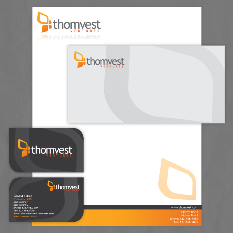
2/3/20 ID Package
|
Project Details:
You should examine your logo, color choices, image themes and the nature of your imaginary business, service or organization. Expand on these elements and design elements that are complimentary. Good identity package designs will accentuate the logo without detracting from it. Create a design for each of the elements listed below. Create a new document in Illustrator or Photoshop for each element, then combine to create a preview:
Create a new document in Illustrator or Photoshop. Create a custom sized file, or try one of the many presets listed. Place your logo in your document and design elements and use colors that compliment your logo design. Create the 4 different designs, then combine in 1 file to create a preview. Add a slight drop shadow and a fake desktop background. |
| ||
1/27/20 The final logo
Due Sunday, February 2 at 11:59 pm.
Step 1
Study your 2 sets of 5 logos from your sketches assignment.
Now, determine which one of the five thumbnails for each set, best represents something about you.
Now you have 3 winners.
Step 2
From the 3 winners, decide which one best represents your company over all. This is the logo you will build in
Illustrator/Photoshop. You will need to include the company name in the design, so you will want to sketch some more
arrangements. Remember that there are 5 categories of logos. Sketch a few solutions using either a combination mark, an emblem and a lettermark.
Step 3
Once you decide which logo version you like the best, you will build it in illustrator/photoshop.
I am looking for overall creativity. Relevance to your company lists. Technical ability with Illustrator.
Gradient tool, masks, and type selection, drop shadows, color theory etc.
How it looks matters, but so does the technical aspects. All shapes need to be closed. Curves need to be made by properly bending the line, not a string of 5000 points. Use gradient fills when possible.
Did you use a mask?
Employ the skills that you have learned through all of the exercises that you completed.
Share it to [email protected]
1/23/20 Logo List and Drawings
Due Sunday 1/26/20 at 11:59pm
Step A - List
Begin compiling a list of 30 (or more) words that describe your company and or product, We want descriptive words. If your company is a sports product for instance, describe the kind of performance it is for rather than list the sports people play.
Step B - Matching
From your list, choose Three (2) pairs of words. Match words that offer a funny or unique pairing. The more naturally the words go together, the less creative or more expected the result will be. For instance, "green" and "pants". These 2 words naturally go together, so there isnt an unexpected outcome from this pairing. While "cereal" and "mustache" could create some very interesting images.
Step C - Drawing
Now make a drawing of your interpretation of the two words together.
Make Five (5) drawings for each of the 2 pair of words as a minimum quantity.
Deliverables:
The more quality drawings/pairs you do, the better your chance of a higher grade.
Thats 10 drawings in all, plus the word list.
Share it to [email protected]
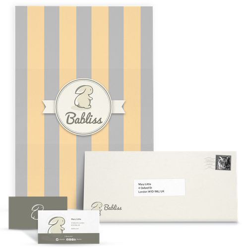
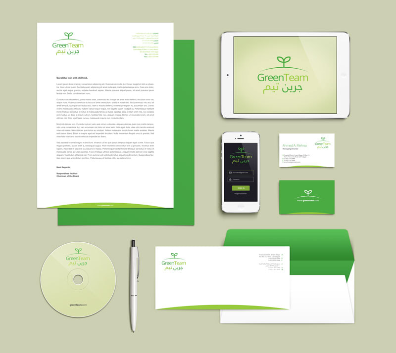
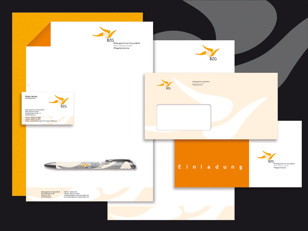
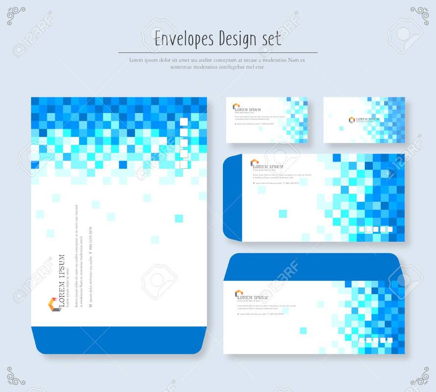
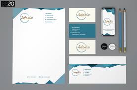
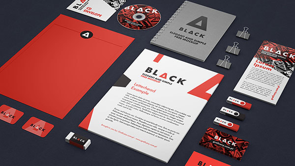
1/20/20 ID Package
|
Logo
This is a design study exercise. Create an imaginary business, service or organization and then create logos by using the 5 different categories of logos. The final step is to create original logo concepts and render them digitally. There is a PDF file attached to this lesson that shows examples of the 5 logo styles. The final logo created from this exercise will be used to create an identity package. ID Package In this project, you will expand on your logo design and create an identity package for the business, organization or service. An identity package consists of elements such as business cards with front and back designs, letter head, envelope designs, cd or dvd labels or any other element the client might need that is specific to their industry. Create a design for each of the elements listed below. Create a new document in Illustrator or Photoshop for each element, then combine to create a preview:
Create a new document in Illustrator of Photoshop. Create a custom sized file, or try one of the many presets listed. Place your logo in your document and design elements and use colors that compliment your logo design. Create the 4 different designs, then combine in 1 file to create a preview. Add a slight drop shadow and a fake desktop background. Add your name to the lower corner, "designs by ____" |
|
|
| 1_c_typesoflogoslecture.pptx |
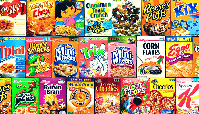
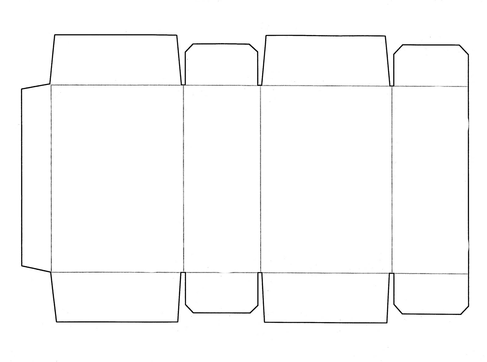
12/2 Cereal Box Project Overview
|
Due end of class on Final Day
Each student will design the packaging for a new cereal. You make up the name and the concept for the new cereal, but you must base the concept on the elements of art and/or the principles of design. Look at the examples of cereal boxes to the right before beginning to draw. What will you put on the front of the box? What types of images do you think of when you hear the name of your cereal? What colors will you use that will make people want to buy the cereal? Using Illustrator and photoshop, you will create a box for a new cereal. The design should include: - A logo for your cereal box (the name of the cereal should be the most prominent element in the logo) - A slogan or tagline that captures the essence of you cereal - The name of the manufacturer producing the cereal - A brief description of the cereal. Ex. "Sweet puffs with a touch of honey" - A graphic image of the cereal itself, ex cereal in a bowl. - The net weight of the cereal box (expressed in ounces) - A special offer, premium, or promotion to entice consumers to buy your cereal. Ex. "Inside: Mail-in offer to win a free iPod" - The Nutrition Facts - Bar Codes - Back Panel Deign - Box Side Design - Box Top And Bottom Design Elements of Art Line. Color. Shape. Form. Value. Space. Texture. Principles of Design Balance Repetition Contrast Emphasis Scale Unity 12/2 Step 1 - Be SketchyDue Wednesday December 4, 2019
Part 1 Fill out the creative brief posted below Develop 3 rough sketches of 3 different ideas and layouts of your cereal box. All includes must be present on each sketch. No color yet, just well developed full size sketches. One per page. Indicate font style, prize presentation, character, product, background treatment, manufacturer name, sub head/description blurb and net weight. |
| ||
12/2 Step 2 - Sketch to Illustrator/Photoshop
|
Illustrate your Cereal Box Cover Design.
1. Begin by designing your cereal logo. Build it with several layers of color, texture and outlines. Include highlites, shadows etc. Look at samples from google. Make it robust. It should be one of the main attention grabbers of your design. Consider its size and relation to the other parts of your box. 2. Design your main character 3. Design the cereal. Consider combining a texture with a variety of shapes used as a mask. Include shadows, gradients etc to allow for as much realism as you can get. Really push your knowledge of Illustrator her. We want it to look realistic. 4. Design your background so it allows your cereal and your logo to pop off the background. Consider your color theory knowledge. Google the color wheel for color relationships. 5. Design your manufacturer logo, your subhead text, net weight requirements and your FREE INSIDE Elements. 6. Your overall design should include the elements of art and Principles of design as structure to your composition. Your end result should have a visual emphasis, a flow for the eye to follow, and be on mark with your target market. |
| ||
12/2 Step 3Part 2 - Box Back
Now create the back of the cereal box design. Must include: 1. Manufacturer name 2. Cereal Name 3. Continue theme from the front 4. Game, fun facts or some entertainment value element. 12/2 Step 4Part 3 - Sides
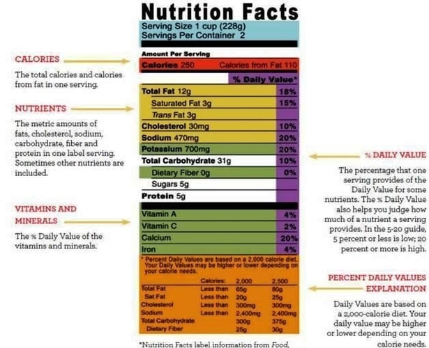
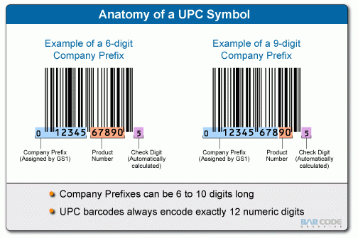
Must include Nutrition Facts. See sample below Must create from scratch with editable type, tabs set. correct format. Ingredients. Editable text, correct format. Messaging that reinforces your theme and brnd Bar Codes. See sample below. |
|
11/19/19 Space Worksheets
Due, Sunday November 24th @ 11:59 PM
Download the worksheets and make a composition in each of the boxes
Download the worksheets and make a composition in each of the boxes
| elementsofart_space.pdf |
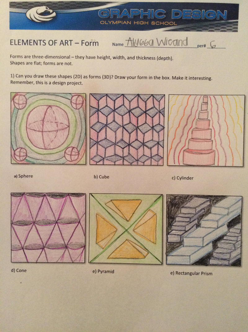
11/19/19 Form WorksheetsDue, Sunday November 24th @ 11:59 PM
Download the worksheets and make a composition in each of the boxes
|
| ||
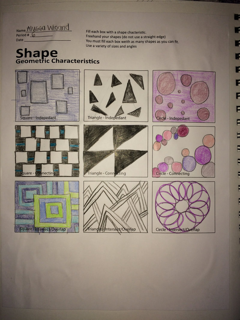
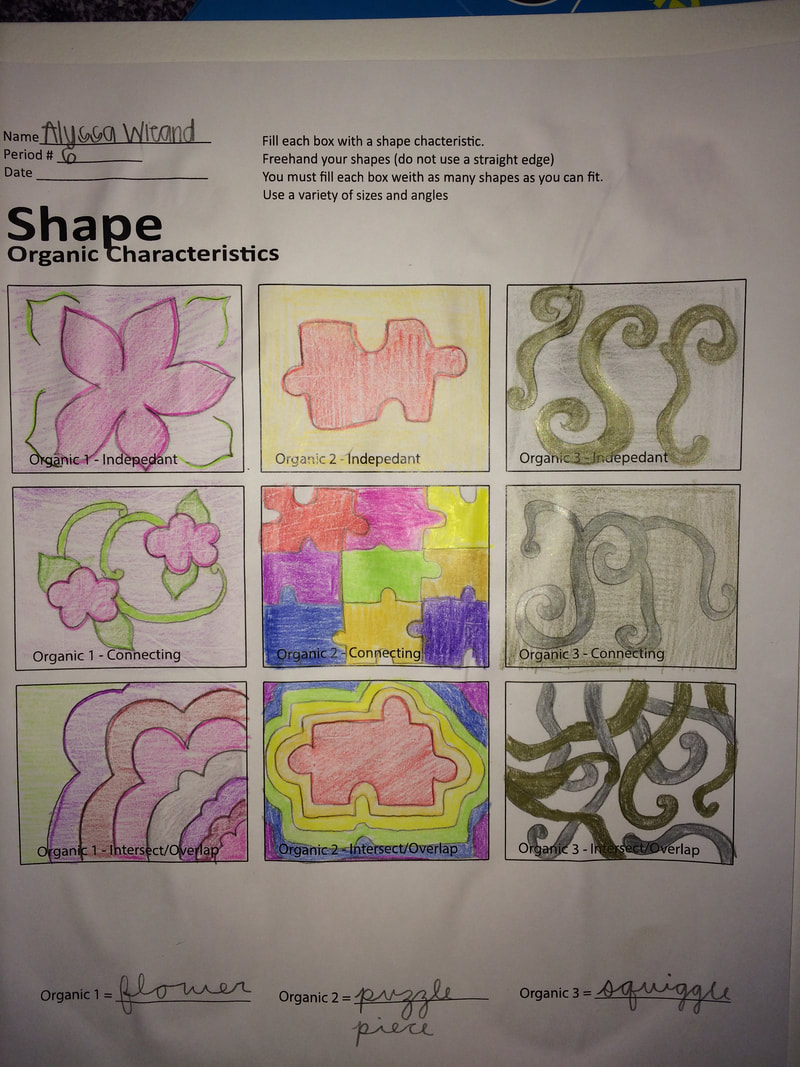
11/18/19 Shape WorksheetsDue, Sunday November 24th @ 11:59 PM
Download the worksheets and make a composition in each of the boxes
|
|
| ||||
11/14/19 Line WorksheetsDue, Sunday November 17 @ 11:59 PM
|
| ||||
Neil Harbisson - I Listen To Color
Due Friday, November 8, at the end of class
Once you view it, answer these questions, then write a reflection about what you find inspiring about his story.
Questions
1. Where did Neil Harbisson grow up?
2. What was the name of the condition he was born with?
3. Specifiicaly, what does the sensor do?
4. What 2 historical figures did Mr Harbisson compare speeches from?
Reflection
Relate his creativity process to some creative aspect of your life, and describe how it applies to you specifically.
Remember our reading skill of Describe and use it in your writing.
Formulate a position to take about what inspires you and why that is important to you, and support it in your writing.
I need well written sentences and well thought out answers. At least a 5 sentence paragraph.
09/19/19 Music Poster Challenge
|
Due on Friday, October 25 at end of class
Design Specs: Create an 11 x 17 inch music poster for each of 3 challenges. Can be created in a combination of Indesign, Photoshop and/or Illustrator. Challenge 1 Music poster using imagery of the artist or band as main image (80 pts) Challenge 2 Music poster using any kink of imagery EXCEPT any likeness of the artist or band members. (80 pts) Challenge 3: Music poster that is Typographic dominant. (80 pts) Deliverables: 1. 3 Rough Comps (Tight Sketches) per Poster 2. Inclusions:
Explain successes and difficulties of each poster. 3 paragraphs Grading Criteria 1. Use of Balance 2. Use of Contrast 3. Use of Color theory 4. Focal Point created 5. Composition |
Challenge One - Artist Poster examples
Challenge Two - Imagery Poster Examples
Challenge Three - Typography Poster Examples
|
8/15 Type Portrait
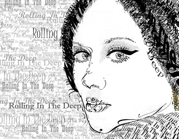
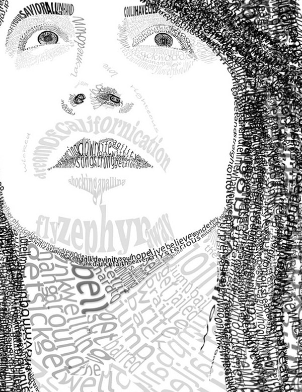
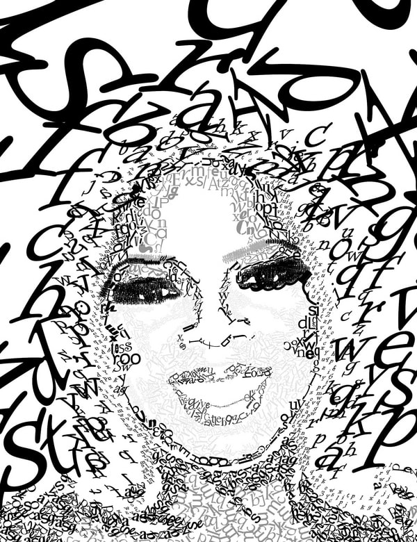
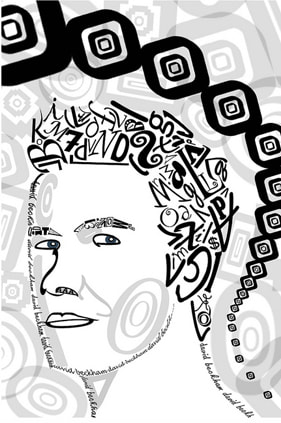
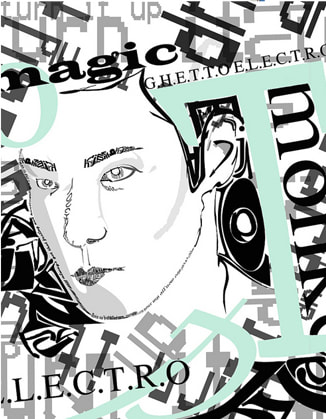
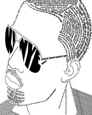
Due Tuesday, September 6, at the end of the period.
Art Principle: BALANCE, COMPOSITION, EMPHASIS, UNITY
Your assignment is to make a portrait using only typographic characters. Use the letters to illustrate the face. Study your subject's face and its characteristics. Examine the forms of typographic elements closely to determine what will represent best.
Process letters, numbers, and alphabetic symbols such as parentheses are allowed, as are combinations of different typefaces.
1. Make a list of 10 famous/inspirational leaders/people whom you identify with. They could be political leaders like John F Kennedy, Rock Bands like Bono from U2, Social movement leaders like Martin Luther King, Oprah Winfrey, Albert Einstein etc. You should choose someone who represents something good and who is identified with a famous saying, quote, or otherwise well known cause.
You can use statements that are relevant to your subject, you can use their quotes, you can use lyrics. But there are no lines, everything is a piece of text.
2. Choose your picture
Make it interesting
Asymetrical angles
Profiles
Choose File>Save from the menu bar.
Choose Desktop, and create a new folder
called TypefaceProject
Name your photo, then save your photo to this new folder
3. Open your image in Photoshop
4. SAVE > AS and Rename the original image and save to the new folder:
5. Be sure the following palettes are open:
Go to Window from the menu bar. Show the following Palattes:
Layers Palette, Character Palette, History Palette
6. Choosing the best character:
Start with an eyebrow.
Choose the Type tool.
Type a letter or character that you think will closely represent the shape of the eyebrow. When you click on the image with the type tool, Photoshop will add a new layer to your layers palatte. layer I strongly suggest you name it after the part of the face you are trying to represent i.e. R pupil, or L eyelash, etc.
This will make it easier to find in the layer later if you need to.
Manipulation Options:
Character Palette: (on right side of screen)
Change Font Families
Change Font Size
Change Font Style
Scale Font Horizontally or Vertically
Edit > Transform (From the Menu Bar)
Scale – make the item larger or smaller
Rotate – change the angle of the item
Skew – slide the top to the right or left while the bottom stays fixed
Warp – change any side or corner independantly
Flip Horizontal/Vertical
You will need to experiment with each selection until you find one `that you think best fits the
portrait.
7. Move the font into place:
You can move your font into place over your portrait using the Move Tool ( the black arrow and the first tool in the tool box on the left side of your screen) or by clicking inside the box and moving the font over into position.
8. Check your work without the image underneath:
Go to the Layers palette (on the right side of your screen) and find the “background layer” and close (click on) the eye; the image will disappear. Click again and it will reappear. You can periodically re-check your progress by doing this step to see how your font portrait is coming along without the image underneath.
8. Creating a new Layer:
Go to the menu bar and click Layer > New > Layer.
A window will appear and you will need to name the new layer.
I strongly suggest you name it after the part of the face you are trying to represent i.e. R pupil, or
L eyelash, etc. This will make it easier to find in the layer later if you need to.
9. Working with Layers:
It is important that you understand what layer you are on at all times. You can
tell what layer you are on because it will be highlighted in the Layers Palette.
10. What if you do not like something you created and want it GONE?
You can always choose edit>undo from the menu bar. If there is more than one step you want to undo, click on the last layer in you History palette, now keep clicking on each layer above the last until you see the layer that you want to undo. When it disappears, continue with the correct procedure.
11. Save your work:
Go to File > Save
Be sure to save it to your project folder on your desktop.
Proceed to SHARE it to: [email protected]
8/9 Typography Terminology Test
Vocabulary Test
8/8 Typography Test Study Guide
- Know the names of the basic faces of font families
- Font, Font Face, Font Family – Know the difference
- Know San Serif, Serif
- Recognize what slab serif looks like
- Identify Black Letter style fonts
- Know your cases – upper, lower, title, sentence, all caps, small caps
- Know x height, baseline, desender lines
- Know your type faces
- Describe Decorative – Extreme features or exaggerated serifs
- What is leading, kerning, tracking
- Difference between tracking and letterspace
- Pica measurement
- Paragraph formats
8/6 Begin A History of Type and Vocabulary Review
Note taking / Lecture
8/5 Sketchbook
We must finish this in class tomorrow. If not, finish it at home for homework. If you need me to print the color prints, then you must share the documents to [email protected]. Please put your name at the top of each page.
1. Today, we will be going online (google images) and finding examples of the vocabulary.
2. Place those images on a Google Doc and properly Identify them. Look for signs, menus, logos, or online magazines advertisements.
Find 2 examples of each.
3. Cut them out and paste them into your sketchbook and identify them.
4. Take a picture of them in IN YOUR SKETCHBOOK.
3. Submit to [email protected] so they can be printed.
Be sure your name is on the paper.
8/1 Terminology
1. Watch the Intro To Typography Video
2. Create a google doc from your Homework Folder, or get your sketchbook.
3. Play the video again at your own pace.
https://www.youtube.com/watch?reload=9&v=tWFWJGA7qrc
4. Write down in your google doc each term that the host mentions during the video, or in your sketchbook.
5. Terminology Definitions - Search for the definitions and write them down to fill out your vocabulary document.
4. BRING YOUR SKETCHBOOKS ON THURSDAY!
7/29 Intro To Typography
|
1. Presentation: What is Typography
2. As we look at the ads Displayed one by one, Please answer the following set of questions for each one:
3. BRING YOUR SKETCHBOOKS ON THURSDAY! |
Process:
1. Brainstorm images that may be successful as a typographic work of art. Be mindful to think about composition on a small 8x10 inch page. What will work well that has a balance of not too much and not too little detail? 2. Once you decide on your celebrity/famous person, create a list of at least 40 descriptive words that tell this person’s story, what they stand for or represent. These are words that we will include in our composition. 3. Start by exploring different fonts. Study the letters in each alphabet to identify certain characteristics that will suit your portrait. Also explore the subject's face and all the shapes that you find in the face, eyes; really any relevant part. 4. You may use as many fonts or styles of fonts that you would like. You may also just stick to one if it lends itself to your imagery. 5. Color may be used or it can be in black and white for greater impact (shades of black may be used). 6. Your Composition must include the Elements of Value and Line and the Principles of Balance, Contrast and Unity 7. Use your chosen fonts and letterforms to design your image. |
Materials List
Materials Due in class July 29th, 2019
Item Description
1. Must have a gMail account.
2. (1) 9 x 12 hardcover sketchbook
Suggestion: www.walmart.com/ip/Bienfang-Hardcover-Spiral-Sketch-Book-9-x-12-75-Sheets/25099620
4. Six #2 pencils or a mechanical pencil w/ leads
Suggestion: https://www.walmart.com/ip/Mechanical-Pencil-Navy-Green-Plum-Burgundy-Paper-Mate-1738797/14150581
5. A pad of tracing paper (9 x 12)
Suggestion: https://www.walmart.com/ip/Aunt-Martha-s-Tracing-Paper-9x12-50pc-Pad-Pkg/24775254
6. Several Black fine line felt tip pen/marker, i.e. uniball (NO SHARPIES OR PERMANENT MARKERS are allowed)
Suggestion: https://www.walmart.com/ip/Paper-Mate-Flair-Felt-Tip-Pens-Medium-Point-0-7mm-Black-2-Count/21437588
7. A good quality white eraser (No Pink Pearl).
Suggestion: https://www.walmart.com/ip/School-Smart-Latex-Free-Non-Abrasive-Soft-Vinyl-Eraser-2-5-x-0-875-x-0-5-White-Pack-of-20/46057901
8. A quality pencil sharpener (with canister to catch shavings preferred)
Suggestion: https://www.walmart.com/ip/Black-Radiance-Dual-Pencil-Sharpener-Pencil-Sharpener/10315570
9. Black Ink Pen, Fine point (no sharpies or permanent markers)….
10. Colored pencils (12 or 24 colors) stay away from the rose art brand
11. Fine point colored markers (12 basic colors) non-permanent
Donation Credit Materials List
These are items that we need in class, but the district does not supply for us.
Donations are completely voluntary. Due at any time. Any quantity
Paper Towels Optional
Disinfectant Wipes Optional
Hand Sanitizer Optional
Tissues Box Optional
Scotch Tape Optional
Uhu Glue Sticks ( Jumbo size) Optional
Expectation Contract
Contract Due July 29th, 2019
Download it from the downloads page, print it out, and have both you and your parents sign it, then turn it in on or before JULY 29, 2019
Download it from the downloads page, print it out, and have both you and your parents sign it, then turn it in on or before JULY 29, 2019
GOOGLE ACCOUNT
Due @ 11:59pm Wednesday, July 24rd, 2019
Send an unbelievably inspirational quote from your gmail to mine at [email protected]
Be sure it is an account with your name in it. I wont know who [email protected] is.
This must be a gmail account, not yahoo, hotmail or anything else, just gmail.
Send an unbelievably inspirational quote from your gmail to mine at [email protected]
Be sure it is an account with your name in it. I wont know who [email protected] is.
This must be a gmail account, not yahoo, hotmail or anything else, just gmail.
