Type Face Self Portrait
|
Due 05/26
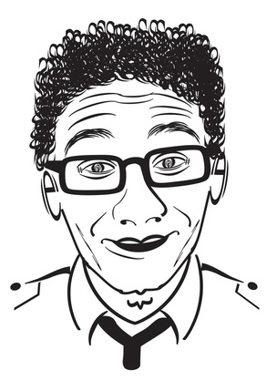
Using the images we shot at the beginning of class as a guide, your assignment is to make a self-portrait using only typographic characters. Load your picture into Photoshop and place it on a separate layer. Then make new layers and add your type to those layers. Use the letters to illustrate your face, thinking about how your design reflects you . Think about your own identity and study your face and its characteristics. Examine the forms of typographic elements closely to determine what will represent you best. Process letters, numbers, and alphabetic symbols such as parentheses are allowed, as are combinations of different typefaces. Your design should be black and white, Typographic Self-Portrait Your Objective: To use the digital image we took of you and compose an original digital self-portrait using only typographic characters and Photoshop as your artistic tool. Rationale for assignment: Technical: To gain a basic understanding of the Type tool, the Transform functions and to become acquainted with the use of Layers in Photoshop. Artistic: To apply the elements of art and principles of design previously learned and create a unique, interesting and artistic self-portrait. Think About It! Look at a variety of type styles and think about how you can use letters, numbers, and alphabetic symbols such as parentheses and other combinations to illustrate your portrait. Think seriously about how your design reflects YOU and your personality, and captures the essence of who you are. Think about your own identity and study your face and its’ characteristics. Examine the forms of typographic elements closely to determine what will represent you best. Your design should be in black and white, although you may use a color background if you wish. |

Before
After
| ||
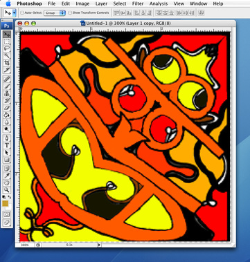
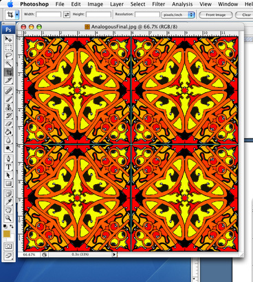
Signature Tile
|
Due Friday, April 29, at the end of the period
Repetition and Pattern In this project, you will be creating a repeating pattern design out of your signature. The objective is to make a simple design become a more complex and completely different design through the use of color and repetition. By repeating the same shapes, you will create a pattern that should create a feeling of rhythm and movement. Objective Understanding Closed shapes and how to fill them Using the transform, paint brush, and paint bucket tools Using creative thinking skills to figure out how to create a unique design using your name. Color theory. You will create two different tile designs. As you execute it in Photoshop, you will choose 2 different color themes to work with, one for each of your designs. Choice between Monochromatic, Analogous, Primary, Complimentary or Tertiary. |
|
|
Instructions
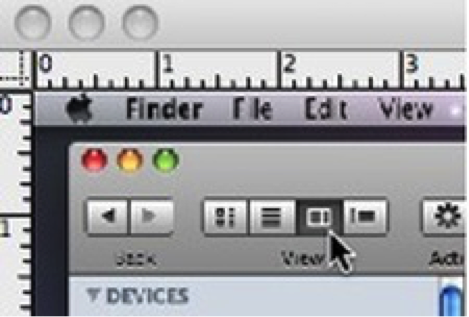
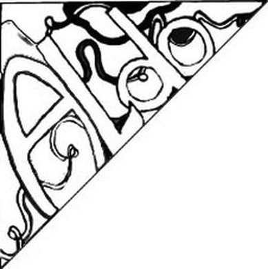
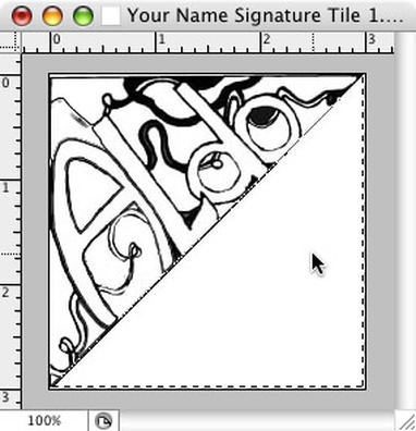
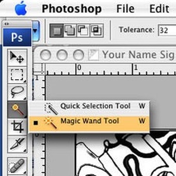
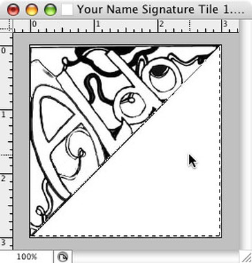
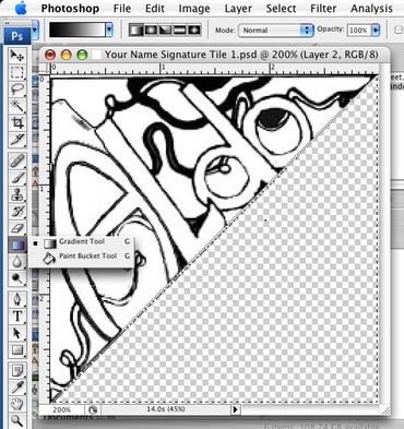
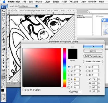
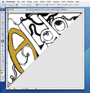
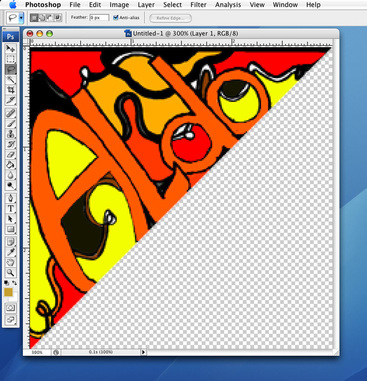
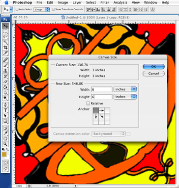
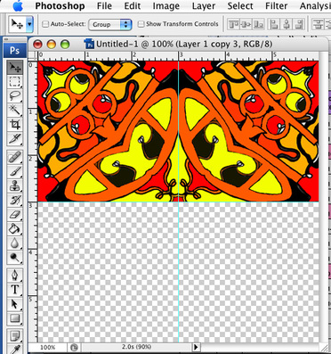
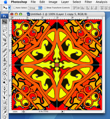
1. Log on to Computer 2. Click on the Mac OS icon (Finder) in the Application Dock. 3. Choose File > New Finder Window from the File menu. You should see a new window open. 4. Select the column view At the top left corner of the finder window, select the third most VIEW selection, which is column view. 5. Start tile design Using the triangle design on the practice worksheet, start by writing your name along the long edge of the triangle. See figure to right Note-Keep in mind that we are going to fill these shapes with color later, so everything needs to be a shape, not a line. Notice the word ALDO is outlined so that we can fill it with color later. Add design elements to your background to add dimension to your design. Be sure to keep everything as an outline. Use your own interests as a source to develop a theme. Use things that you like or describe you Create 2 completely different tile designs, one on each sheet. The other 3 triangles on each sheet are for you to make variations to your design. Get a sign off from the teacher of your 2 best designs before we scan your artwork. Use one sheet per design. 6. Open Photoshop From the Application Dock, located at the bottom of your screen, click on the icon with a blue box and the letter PS inside the box. This will launch the Photoshop application. 7. Create a New Document Select file>new from the menu bar at the top of the screen. Enter the following settings. Name: (Your Name) Signature Tile 1 Width = 3 inches Height = 3 inches Resolution = 300 pixels Color = RGB Background = Transparent 8. Open Scan From the Menu Bar, choose FILE>OPEN. Navigate to your desktop folder and select your scanned image file. 9. Select the Tile From your Menu Bar, choose SELECT>SELECT ALL Then from the Edit Menu, choose EDIT>COPY. 10. Select your Signature Tile 1 File. Choose EDIT>PASTE Close the original scan file, and dont save. 11. Select the Magic Wand Tool From your Tool Box, select the magic wand tool. 12. Position it over the empty triangle in your image, and click once with the mouse. Choose EDIT>CUT from the menu bar. Now choose SELECT>DESELECT from the menu bar. If your selection goes into the art, you have a leak and you need to close it off. If this is the case, Try this. Choose the pencil tool. Place it in the bottom left corner. Hold the shift key, and click the mouse once and let go. Move the mouse to the upper left corner, hold the shift key and click the mouse once again. 13. Filling a shape To add color to your tile, you need to look closely at your artwork and see where all the closed shapes are. You cannot fill an open shape because it will fill other areas that you don’t want filled. Use the pencil tool to close all your shapes. Change the color to white, adjust your brush thickness, and clean up the artwork. From the Tool Box, click on the gradient tool and hold the mouse button down until the pop up window appears. From that, select the paint bucket tool. 14. Open the Swatches Palate. Choose WINDOW>SWATCHES from the menu bar. 15. Select a color At the bottom of the tool box. There are 2 overlapping squares; one black and one white. The one on top represents the FOREGROUND color, the other is the BACKGROUND color. Click in the center of the foreground box to get the color picker window. Click anywhere in the gradient to change the value of red. If you want a different color, select anywhere in the rainbow bar next to it . When you have the color that you want, select ADD TO SWATCHES. Add up to six colors to your swatches palate before clicking OK to this window. Choose colors that naturally go well together for your tile design. 16. Use the Paint Bucket Tool. With your desired color showing in the foreground box at the bottom of the tool box, move the paint bucket over the shape you want to fill and click. 17. Repeat Repeat this step, changing between the six colors you chose from your swatches palate, until your tile design is filled with complementary colors. 18. Building Your Tile Now that you have your tile colored the way you want, we are going to create more sections of this tile. Choose LAYER>DUPLICATE LAYER from the menu bar. Choose EDIT>TRANSFORM>ROTATE from the Menu Bar. Choose EDIT>TRANSFORM>FLIP VERTICLE from the Menu Bar if you need to. to get the second triangle to be a mirror image of the first, see figure to right. 22. Increasing the work area Click on Image>Canvas size. Change the canvas size to 6 inches by 6 inches, and select the top left box in the Anchor selector. Now put a guide at 3 inches from both horizontal and vertical rulers. Choose the MOVE Tool from the tool box, and drag the tile to the top left corner. 23. Now duplicate the layer and move the new artwork to the top right position. Now choose EDIT>TRANSFORM>FLIP HORIZONTAL 21. Duplicate Choose LAYER>MERGE VISIBLE from the menu bar. You should now have only one layer in your layers palate. Choose IMAGE>CANVAS>ROTATE CANVAS to determine the positioning of your artwork. 24. Now choose LAYER>DUPLICATE LAYER . Choose your MOVE Tool from the Tool Box, and move the layer down to fill the empty positions. 26. Repeat the last sequence of steps to create the tile you see in the figure to the right 27. Save your file to your name folder>project folder on the desktop. 28. Choose FILE>SAVE AS and select : Teacher Station > MediaServer > 2015_16 > P# > SignatureTiles. YOUR FILE NAME MUST BE AS FOLLOWS TO GET CREDIT FOR THIS PROJECT (Your First Last Name)_ P#_SignatureTile_ColorVersion.psd. Do not delete the ,psd from the name or you (and I) will not be able to open it. |
|
met·a·mor·pho·sis (mĕt'ə-môr'fə-sĭs)
|
A transformation, as by magic or sorcery.
Due Friday, April 15 at end of period. You will use your magical powers and the tools in Photoshop to create a new animal by combining two or more together. The idea is to blend them so seamlessly that one cannot tell it has been created in Photoshop. Possible tools:
|
|
Sky Replacement Exercise
|


| ||||||
POSITIVE NEGATIVE SPACE WORD PROJECT
Step 1. Choose Your Words Carefully.
As graphic designers, we are story tellers, visual communicators, so pick your pair of words that have a story behind them. This is an important step, because it sets the theme with which you will design. Pick a pair of words that lend themselves to a visual solution. And you CAN NOT use the examples that I have given.
Step 2. Get a personality!
Step 3. Think in the Box!
Step 4. Finalize
1. Take the approved designs to completion in Photoshop.
2. Must be in full color.
Step 5. Turn In
- You want to choose 2 sets of 2 words (That’s 4 words).
- Each set's words have opposite meanings.
As graphic designers, we are story tellers, visual communicators, so pick your pair of words that have a story behind them. This is an important step, because it sets the theme with which you will design. Pick a pair of words that lend themselves to a visual solution. And you CAN NOT use the examples that I have given.
Step 2. Get a personality!
- In your sketchbook, sketch a minimum of 3 different ideas for each word.
Thats a total minimum of 12 sketches. You'll need to do more than 12 to get your 12 best. - Each word should visually represent its meaning. Find a way to give the word a visual meaning.
- Must include Type, and must be executed inside of a shape. the shape should be related to the visual meaning of the word.
We are concentrating on using some of the elements of art, working with positive and negative space, and visually communicating the meaning of the words. - “Rough Comps” due end xxx
Step 3. Think in the Box!
- Review rough comps with Mr X
- Determine a final design for each pair.
- All reviews must be completed by xxx
Step 4. Finalize
1. Take the approved designs to completion in Photoshop.
2. Must be in full color.
Step 5. Turn In
- PowerPoint
PPT must include:
1. The first word pair and the definition of the words, including the phonetic breakdown, the part of speech, etc.
2. Pictures of each sketch to show your preliminary work and the pattern of thought that led you to your final design.
3. Your final designs.
4. Explanation of the visual story your designs tell.
5. Repeat for second word pair.
6. Reflection.
Explain what you have learned from this creative process. Analysis of the process and visual ques that you got from your words to help you tell the story visually.
Brochure DesignWe will be making a brochure design using either you logo from last semester, or for the TUPE innitiative (Anti smoking) The designs to the right are for inspiration.
Brainstorm Your Work Using a creative brief, brainstorm ideas for:
Answering the questions on the Creative Brief will provide a framework for your PSA. Define your purpose, audience and message. Your concept needs to be strong, think about headlines and plays on words or very compelling statements. Be clever. Use strong typography. Employ the elements of art and the principles of design. Brainstorm and research Your subject can be either TUPE (Anti smoking), or a brochure for the company that you designed a logo for last semester. Do some research on the subject. Compile it in a document that addresses the following. 1. Contact information: The company name, address, phone number, website. 2. Facts: 1. 6 facts On how product is made 2 4 Benefits of using the product 3. Where to find the product in the stores or online 4. Someone endorsing the product 5. At least 3 Testimonials Thumbnails Step 1: Draw at least six thumbnail sketches in your sketchbook. Due Sunday, March 6th @ 11:59pm Step 2: Choose your top three designs and draw two detailed comprehensive drawings (comps) each on a separate paper. These are full size folding dummies of the brochure design. Indicate what the font looks like (Is it block letter and all caps, or serif letters in upper and lowercase), what color scheme will it be, what are the pictures going to be. These designs start to give a good feeling of what the final brochure will be. Work them both to the same level of completion. Due Sunday, March 6th @ 11:59pm Step 3: From the final three comprehensive drawings, choose the strongest one for your final layout and design of your brochure. Step 4: Create a color scheme Step 5: Think about what information is most important, and what is the call to action. Step 6: EXPERIMENT with new ideas, do not be afraid to improve your design.You will take this final layout design and produce your brochure in Illustrator or Photoshop or both. Due Monday, March 14 @ end of class Create a 3 column brochure, front and back. Title Page: TUPE Tobacco Use Prevention Education, School Site Back Middle: SUHSD logo, board policy, student name, Site TUPE Advisor name, email address, date Panel Right: Tobacco Facts Inside Left Column: TUPE FNL or Club Live (each site uses different name) • Club advisor name, club meeting location, day, time • How to join club and participate in TUPE activities • TUPE Tobacco Free Monthly Activities for 2015/16 school year • Tobacco Cessation Program available at high school sites only Inside Middle Column: Health Consequences of Smoking Inside Right Column: Health Consequences of Smoking * Original graphics and/or photos may be added throughout brochure D7 DIGITAL DESIGN – “ANTI-TOBACCO” BROCHURE* to promote the District’s TUPE (Tobacco Use Prevention Education) initiative. TUPE site brochure of services, facts, and effects of tobacco. ORIGINAL WORK ONLY. No cigarette of any kind, e-cigarette, or hookah pipe in a SUHSD student’s mouth or hand. Designs that portray a student smoking will be disqualified. More content details: click here * NOTE: “Anti-Tobacco” Categories promoting the District’s TUPE (Tobacco Use Prevention Education) initiative have special prizes: Top entries will be eligible to win iPad minis! |
Thumbnail examplesIncludes for Tupe Brochure:
| ||||
COLOR Worksheet
Fill out the ElementsofArt-Color worksheet using the colored pencils like usual.
2. Download the Color Wheel handout from the downloads page and open it in photoshop.
Use the paint bucket to fill in all of the colors on the color wheel like we did in the demo.
2. Download the Color Wheel handout from the downloads page and open it in photoshop.
Use the paint bucket to fill in all of the colors on the color wheel like we did in the demo.
SPACE and TEXTURE WORKSHEETS
Due Wednesday, February 10 @ 11:59pm
Available on the downloads page
Available on the downloads page
Due at end of period, Wednesday, February 3.
What do skateboarding and innovation have in common? More than you might think.
Rodney Mullen is the godfather of street skating, and in this exuberant talk he shares his love of the open skateboarding community. He shows how the unique environments skaters play in drive the creation of new tricks — fostering prolific ingenuity purely for passion's sake. Mullen spends his spare time thinking about open source communities, hacking the urban terrain, and transforming the mundane into something new.
Follow the link, watch the video, and then write a reflection answering the prompt of
What do skateboarding and innovation have in common?
https://www.ted.com/talks/rodney_mullen_pop_an_ollie_and_innovate#t-118339
Form Worksheet
Due Thursday @11:59pm
Go to the downloads page and print the form worksheet.
Go to the downloads page and print the form worksheet.
Elements Of Art Worksheets 1-4 |
| ||
Line Emotion, Line Direction, Shape Organic and Shape Geometric Worksheets are due Sunday, January31 @ 11:59pm.
Digital Scavenger Hunt 3
Due Sunday, January31 @ 11:59pm
This project is about perception, creative thinking and digital media use. Be inspired to show the definitions through your eyes.
1. Site the definition for each of the words.
2. Find the picture that best expresses the essence or the spirit of the word. Remember. your classmates are searching the same thing, so try to find unique images that no one else will use. Dig deep in the search pages, don't go with the first thing you see.
3. Cite your sources
REMEMBER- Don’t stop at your first idea. I dont want the obvious picture. Be creative. Interpret the meaning. Find the most eccentric way out example of the word. Use the definition to help you find the most expressive picture you can find…..and have fun with it. All of the words should be searched within the context of GRAPHIC DESIGN
1. Background
2. Capture
3. Compression
4. interactive
5. Script
6. Navigation
7. Rollover
8. Treatment
9. Negative space
10. Texture
11. Proof
12. Form
13. Unity
14. Proximity
15. Saturation
Digital Media Showcase

|
| ||
http://vapa.sweetwaterschools.org/digital-media/digital-media-showcase
Follow the link to the competition website. Review the rules
Submissions Due: March 16, 2016
Digital Media Showcase: April 28, 2016
Otay Ranch H. S.
6:00 pm
COST $0 per entry
We are going to enter projects from last semester and this semester.
Our goal for each project we do, is to win the competition by making every project that we do the best we have ever done!!!!!!
Pos/Neg Example Description Homework
|
Due Sunday, January 17, by 11:59pm
1. Find 15 different positive negative/picture examples.....that are not the ones that I used in the presentation 2. Explain what is appearing as the positive AND the negative space. 3. Identify any of the Elements of Art that are in play with each picture. Use your Google drive account and SHARE it with me at [email protected] |
| ||
Multimedia Vocabulary
Due, Tuesday at 11:59pm
1. Define each term listed below.
2. Write a sentence using the word.
3. Share the document to [email protected]
4. Be sure to include your name and period #
5. Site Your Sources (Wiki is not a reliable source for information )
Adobe Acrobat
Adobe Photoshop
Adobe Premiere
Animated gif
Animation
Audience
Authoring program
Background
CD
Clip art
Compression
Copyright
Domain name
Fonts
Interactive multimedia
Nav bar
Pixel
Portfolio
Text Box
Identities Name Logo
Due Tuesday, December 15 at the end of the period
No work, besides the final name logo, will be accepted after Sunday, December 14
THE FINAL LOGO
Step 1
Study your 3 sets of 5 logos from your sketches assignment.
Now, determine which one of the five thumbnails for each set, best represents something about you.
Now you have 3 winners.
Step 2
From the 3 winners, decide which one best represents you over all. This is the logo you will build in Illustrator. You will need to include your name in the design, so you will want to sketch some more arrangements to include your name. Remember that there are 5 categories of logos. Sketch a few solutions using either a combination mark, an emblem or a lettermark.
Step 3
Once you decide which logo version you like the best, you will build it in illustrator.
I am looking for overall creativity.
Relevance to your identities lists
Technical ability with Illustrator.
Gradient tool, masks, and type selection and use.
How it looks matters, but so does the technical aspects.
All shapes need to be closed.
Curves need to be made by properly bending the line, not a string of 5000 points.
Use gradient fills when possible.
Did you use a mask?
Employ the skills that you have learned through all of the exercises that you completed.
IDENTITIES LIST
HOMEWORK
Due @ 11:59pm Tuesday December 8th.
Step 1 - List
Make a list of a minimum of 30 words which describe you. Use your identities assignment to identify the different things about your name, family history etc that you can use to visually describe you. You have things that you like to do, places you like to go, sports you like to play etc to use to describe you as well. Use your name, not Tony Stark, Peter Pan, Batman, Spider Man.....or Cap'n Crunch!
Step 2 - Matching
From your list, choose Three (3) pairs of words. Match words that offer a funny or unique pairing. The more naturally the words go together, the less creative or more expected the result will be. For instance, "green" and "pants". These 2 words naturally go together, so there isnt an unexpected outcome from this pairing. While "cereal" and "mustache" could create some very interesting images.
Now make a drawing of your interpretation of the two words together.
Make Five (5) drawings ( thumbnails ) for each of the 3 pair of words that you have matched together as a minimum.
The more quality drawings/pairs you do, the better your chance becomes of finding that awesome idea for your name logo..
That's 15 drawings in all, plus the word list as a minimum!.
IDENTITIES
YOUR NAME STORY
Due by 11:59pm Sunday, December 6th
Sure, we know each other’s names, but do we know the story behind that name?
Think about the story of your name.
Create a new Google Doc, name it “Identities”
Jot down your thoughts and feelings about the story of your name.
include the following:
State your name, age, birthday, place you were born
-Why did your parents choose your name?
-What is your family History?
-If you were named after someone, who was it?
-In what country did your name originate?
-How has it changed?
-What does it mean?
-How do you feel about it?
-Would you change your name? To What?
-What were 3 main headlines in the news the day you were born?
TYPES OF LOGOS - Sketchbook Assignment
|
Due @ 11:59 pm Monday November 26th.
Find 4 samples of each category of trademark types. Two of your samples can be from the internet search, 2 need to be torn out from a magazine, newspaper, or some sort of printed material. 1. Wordmark 2. Abstract Mark/Symbol 3. Lettermark 4. Combination Mark 5. Emblem Mark Be sure to identify which marks you are categorizing. Write the definitions of each trademark type. Print out your internet samples, and tear out your printed samples and glue them all into your sketchbook. Take a picture of each page, and share them with [email protected] |
| ||
DIGITAL SCAVENGER HUNT 2
Due Tuesday, December 1 @ 11:59pm
This project is about perception, creative thinking and digital media use. Be inspired to show the definitions through your own eyes.
1. Site the definition for each of the words. (Remember to keep in in the context of graphic design)
2. Find a picture that expresses the essence or the spirit of the word.
REMEMBER- Don’t stop at your first idea. I dont want the obvious picture. Be creative. Interpret the meaning. Find the most eccentric way out example of the word. Use the definition to help you find the most expressive picture you can find…..and have fun with it.
LIST
animate
occupy
abstract
collaborate/tion
abundant
rhythmic
exuberant
tablet
fury
layers
neutral
nimble
awkward
thumbnail
TECHNOLOGY LOGO
Steps 1 - 5 are Due Sunday, November 8th at 11:59pm
Following the example, design your own icon based on a geometric shape (Square, Rectangle, Cylendar, Cone, Triangle, etc.).
1. Research technology company logos.
2. Choose 10 of what you think are the worst logos, based on readability, clarity of concept and style. Download the examples to your project folder in a sub folder called "SOURCE_TECHNOLOGY"
3. Create a google doc.
Place all 10 logos each with an explanation of what you think makes it a bad logo. List at least 3 reasons for each logo. (10pts)
4. Make a second list of the top 3 you would like to create a new logo for. Include your reasons for choosing them. (10pts)
5. Pick a winner and explain why you chose it. (10pts)
6. Sketch in your sketchbook before you begin your design. You should be able to sketch 5 different ideas.
Show me your sketches by taking a picture and sharing it. (25pts)
2. Choose the best one of your sketches to design.
3. Create your icon in illustrator. (75 pts )
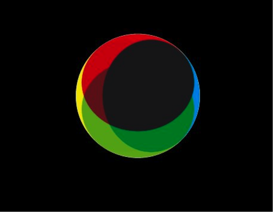
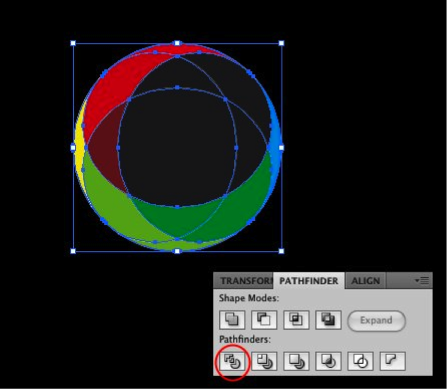
RING IT!
|
Exercise DUE at end of class, Monday, November 2nd, 2015 Final Icon Due Monday, November 9th at the end of class I have posted some great logos using 3D effects and colorful gradients. There are quite a few ways to create those effects in Illustrator, however for most of them you will have to use the Pathfinder tools. Because of that, I will show you an example based on a few logos from that list. |
|


|
Step1
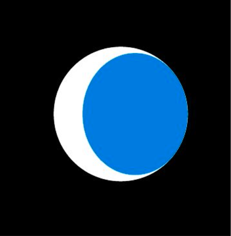
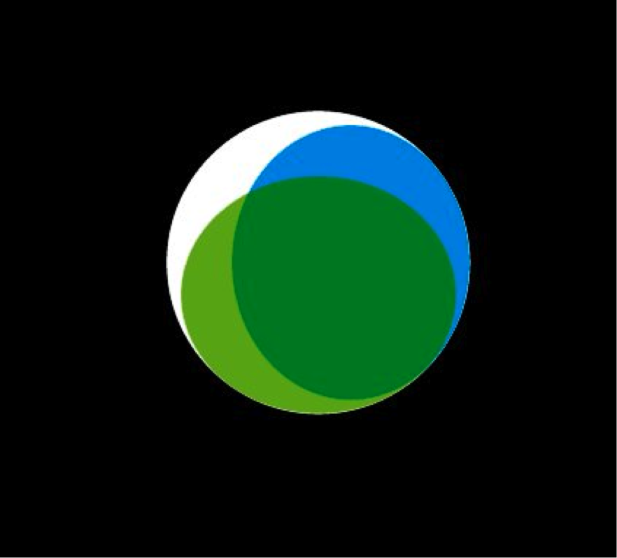
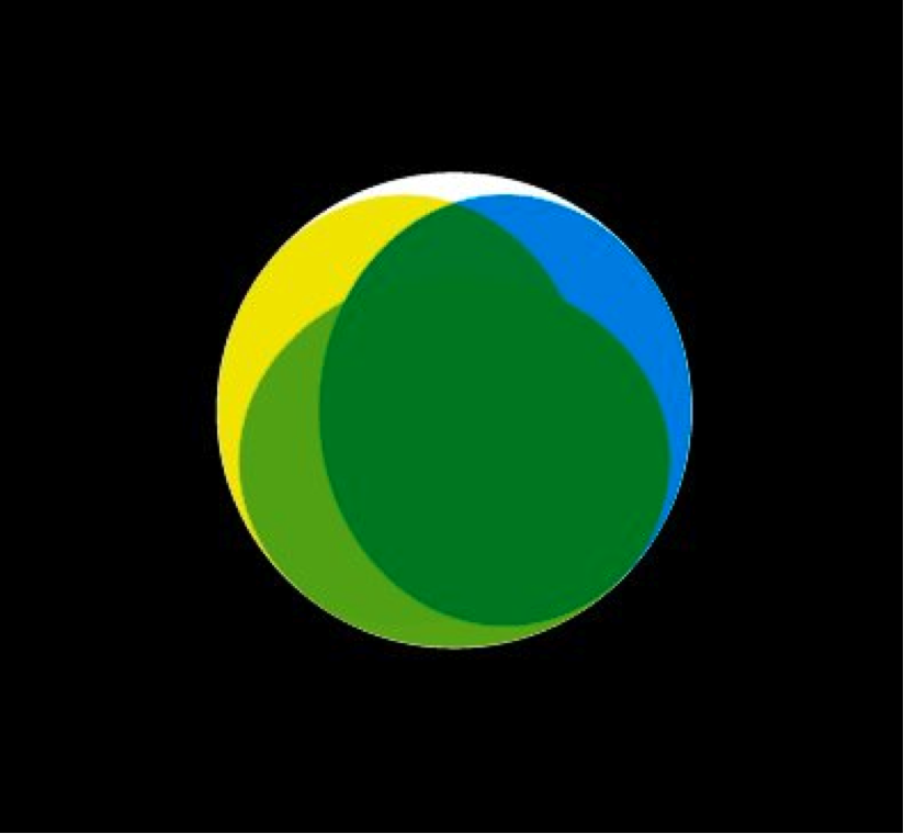
Open Adobe Illustrator and create a new document. With the Ellipse Tool, create a circle. Step 2 Select the Circle; Choose EDIT>COPY, EDIT> PASTE IN PLACE. resize it to be similar to the figure to the right. Use the Black arrow tool to resize it. Align it to the Right. Also change the Blending to MULTIPLY and use CYAN for the color. Step 3 Repeat the same process of the previous step, this time however reduce the height of the new circle. Also use green for the color. And align it to the bottom. Use the figure to the right for reference. Step 4 Select the BLUE Circle and choose EDIT>COPY, EDIT>PASTE IN PLACE. Align the new circle to the LEFT and use YELLOW for the color. Step 5 Select the GREEN Circle and choose EDIT>COPY, EDIT>PASTE IN PLACE. Align the new circle to the TOP and use RED for the color. Step 6 Select all ellipses and go to the PATHFINDER PANEL (Window>Pathfinder). Click on DIVIDE, it's the first option in the Pathfinders. This command will divide all the elements allowing us to use different colors for each one. Step 7 Experiment with the colors. Step 8 You can try gradients with the Gradient Tool (G) to create a nice 3D Effect. Step 9 If you need the logo in one color over light or dark backgrounds, the best thing to do is add a stroke to the elements. Conclusion Even though it looks complex, this technique is quite simple and it results in a very nice effect. That's why we've seen more logos using it. Also one of the coolest things is that you can try different shapes and colors that will result in another type of effect. If you have seen the logos I used for reference, Terra, Qwell and South Creative, they use this effect just changing shape sizes and colors, while the Aramova, uses the same technique but forming a triangle instead of a circle. |


|
TURN IT IN
Save all of this in a new folder called RING IT, in your name folder on your desktop. Upload it to your google account, and share it to [email protected].
Save all of this in a new folder called RING IT, in your name folder on your desktop. Upload it to your google account, and share it to [email protected].
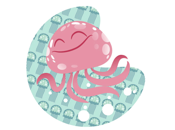
ILLUSTRATOR PATHS AND MASKS
|
Due, Monday, October 26 at the end of class.
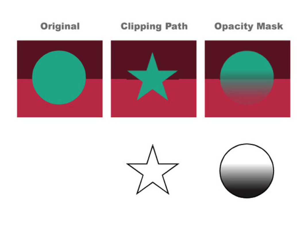
First let’s define the difference between a Clipping Path and an Opacity Mask:
It may be easier to understand with this simple example to the right: The circle on the left is the original art with no opacity or clipping applied. In the middle I have applied a star shaped Clipping Path to the layer containing the turquoise circle path. Because Clipping Paths is a yes or no concept, the operation only recognizes if there is or if there is not a path. The circle is revealed where there is a path, and hidden in the absence of that path. The circle on the right, I have applied an Opacity Mask to the turquoise circle path. Because Opacity Masks recognize the full range of black to white, I used a gradient to show the range of values between full opacity and no opacity, something we will do again in just a bit. Of course we can create Opacity Masks of any solid shade of gray to assign different percentages of transparency/opacity. The default settings for Opacity Masks are: white is visible, black invisible, all the grays in-between relate accordingly. Part 1 Clipping PathsClipping Paths are a great tool – I use them for 2 primary reasons:
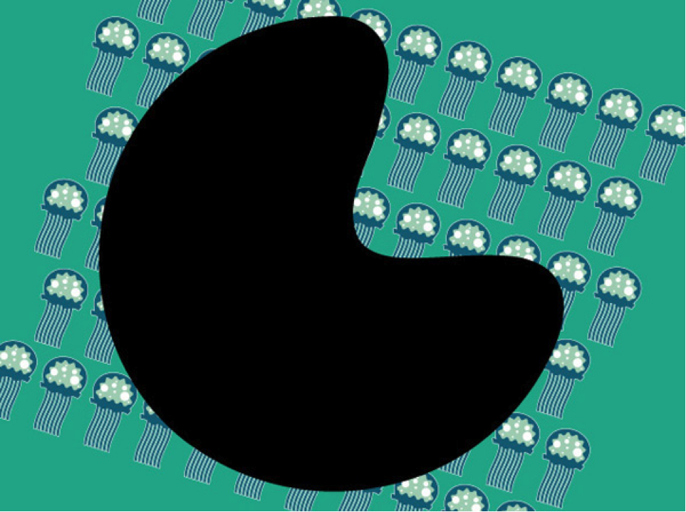
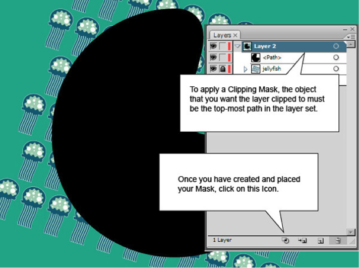
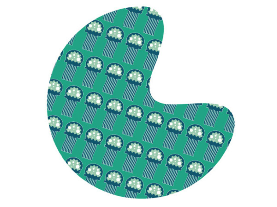
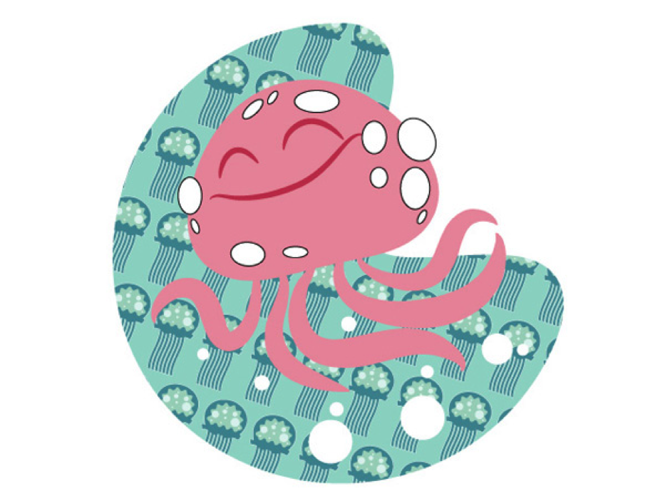
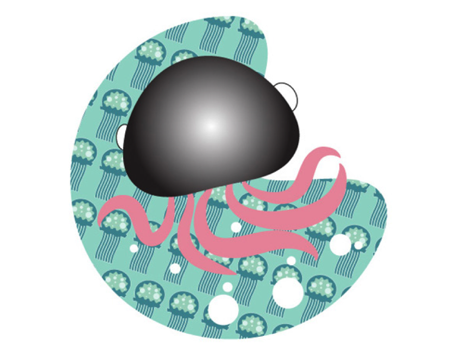
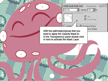
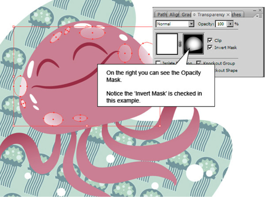
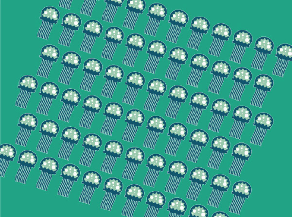
Step 1 For this demonstration I’m going to Clip the background to the right to a specific shape. Both the turquoise and the jellyfish are in the same Layer. Download the file (Located at top of this page), save it to your project folder, Choose FILE>PLACE to get it on to your new document in Illustrator. Step 2 Now we need to create a path or shape to Clip to. This example is similar to what I might do for a small spot illustration. Rectangles are so boring and predictable, let’s do something organic. So that you can easily see it, I’ve set the shape I want to clip as solid black. I usually draw this path unfilled, with a thin stroke so that I can see beneath it for accuracy. Step 3 If the Path you want to clip the layer to is not at the top of the layer set, move it there and click on the Make/Release Clipping Mask button at the bottom of the Layers panel. The Icon shows an outlined circle and square with their union shaded in. Be sure to select the layer that you want to apply the Clipping Path to, in this example it is "Layer 2," not the path itself. Now once the Clipping Path is applied, you can see the results. Only the artwork directly beneath the Path is revealed. At any point you can always grab the Path and move it around if you want. Many times your Clipping Path may not be perfectly aligned so it’s nice to have the ability to nudge stuff around. Even the shape itself isn’t permanent - you can edit the individual control points! You can release the Clipping Path by selecting the Clipping Path and clicking on the same icon that created it in the Layers panel, or to completely remove it you can drag the path into the Trashcan in the Layers panel. Part 2: Opacity Masks Step 1 I’ve placed a simple JellyFish character in front of our freshly Clipped background. We are going to add some spots to the Jellyfish that will fade as they near his eyes and mouth. I’ve outlined the spots here at first so you can see where they overlap the white background. Step 2 Now I have selected the body of the Jellyfish and copied it and Pasted in Front. I then applied a simple gradient through the Gradient panel. You can see this shape below, we are going to use this as the Opacity Mask. Step 3 I then Cut the new gradient shape to remove it from the artwork, keeping it in the Clipboard for use in just a minute. After selecting the white dots and Grouping them, I move to the Transparency panel and double-click in the blank area next to Thumbnail of the dots. With the path/object/group that you want to apply the Opacity Mask to selected, double-clic in the Transparency panel to activate the Mask Layer, as shown below. Step 4 Now that I have told Illustrator to apply an Opacity Mask to the Group of dots, I Paste in Front again (Paste in Front/Back are nice commands as they take the copied/cut paths and place them in the exact location where they came from) in this Opacity Mask area. Command + F is Paste in Front and Command + B is Paste in Back. If you visually see the gradient on the Artboard after you paste, it means you aren’t working in the Opacity Mask area. In the Transparency panel you will notice a slight outline around either the left or right square. The left square is your Artboard artwork, the right is the Mask. It’s easy to forget if you are working on the Opacity Mask or the Artboard so make sure you are working on the correct one. When you paste into the Opacity Mask you won’t see it on the Artboard, but a preview of the shape(s) will show up in the Transparency panel, as shown below. You will notice an icon of a Chain Link in between the two. This means if you move the artwork the Mask moves with it. If they are unlocked (by clicking on the icon) you can move the artwork independently of the Mask. This is useful if for instance you have an Opacity Mask in the shape of a shirt, but the pattern isn’t lined up correctly, you can move the pattern and the shirt stays still. Also, notice I clicked Invert Mask in the Transparency panel. This simply changes whether black or white acts as the transparent or visible end of the spectrum and vice-versa. Conclusion I move back to the Artboard and added some bright white highlights with no Mask to make the Jellyfish pop as well as toning down the background and adding a bit of gradient to the tentacles. And here’s the finished product! Opacity Mask and Clipping Paths can free up a lot of time for an artist or designer, learn them well and they will be some of your best tools. 
|


| ||
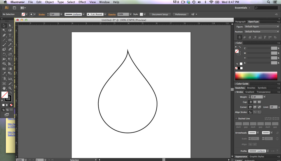
ILLUSTRATOR PRACTICE ONE
|
Due at end of class 10/16/15
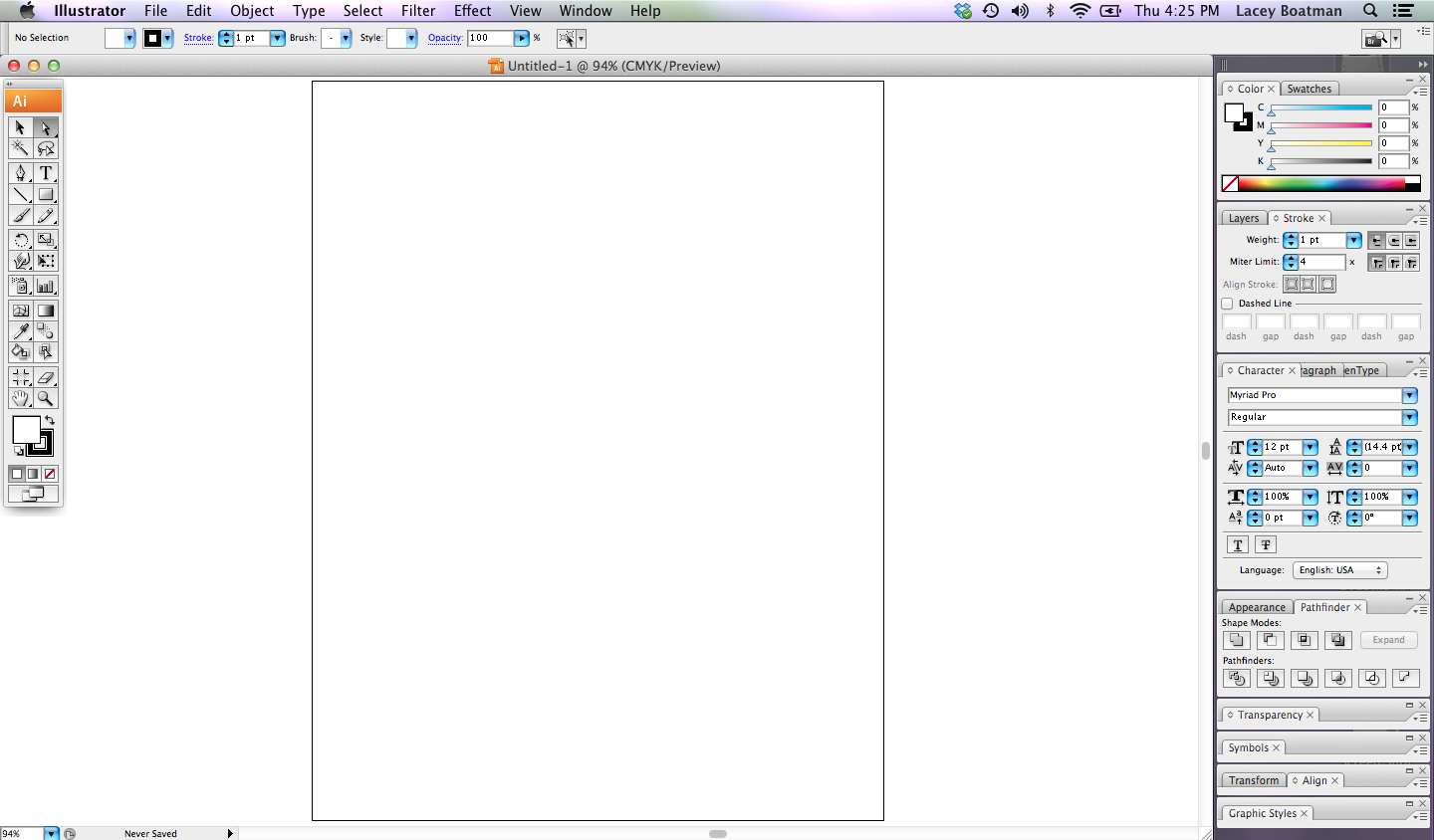
Can You Make This Shape? "How was this shape made in Illustrator? Can you make the same shape? Open Illustrator and try." Before attempting to re create the shape, study the screen below to better understand the available tools and palettes. |
|

|
EXERCISE 1
1. Download and print the file to the right. 2. Identify as many of the parts of this screen as you can. You can write directly on the page. 3. Draw a line to the tool and add the name that you think it is, and what you think it does. 4. Repeat this for as many of the tools as you can. 5. Do the same for the palettes. Test yourself. This is a teaser, not a test, so try it without looking at the screen. 6. Turn in the paper. Be sure your name and period # are on the page. EXERCISE 2 1. Open Illustrator, create a new document as letter size, File > New. 2. Save it to your name folder on your desktop in a new folder called Tear Drop. 3. Name your file, Teardrop Trial. 4. Try to recreate the tear drop shape shown above. Use the pen tool and try to use as few points as possible. Remember, we make a line by showing illustrator the beginning and the end of the line, not by clicking a thousand clicks along the way. To curve the line, click and hold and drag the mouse to drag the handles out of the point. 5. Share the file to [email protected] EXERCISE 3 1. Download the file to the right. 2. Save it to your Name folder on your desktop. 3. Create a new folder titled Practice Sheet One. 4. Choose FILE >NEW to create a new file with a dimension of 8.5" wide x 11" tall 5. Choose File>PLACE and navigate to your name folder to place the practice sheet file onto your illustrator document. Be sure to to lock it down (OBJECT>LOCK>SELECTION) It is a practice worksheet that has many boxes. Each box has a line or a shape. In the bottom half of the box, try to recreate the line or shape using illustrator. |
| ||||
Illustrator Exercise_Broker Sign
|
Due by end of class on 10/14/15
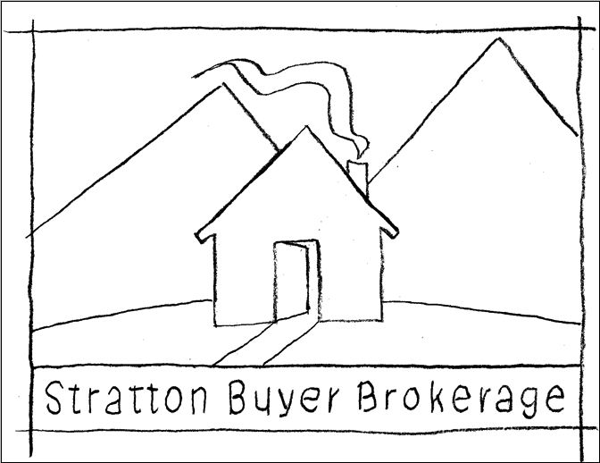
1. Make a folder inside your projects folder and name it Broker Sign 2. Download the brokersign.jpg file to the right and save it to your Broker Sign Folder. 3. Launch Illustrator. Open a new document that is 11" wide x 8.5" tall. 4. Choose FILE>PLACE and navigate to the broker sign.jpg file. Select Place. 5. You'll notice that there are handles on all 4 corners. This tells you that the picture you placed is still selected. With it still selected, from the OBJECT menu, choose LOCK>SELECTION. This will keep the picture from moving as you draw over it. 6. Choose the pen tool and begin to draw each of the shapes. Each shape must be "closed" and on a different layer. 7. You can add embelishments if you want, but you will be graded on how complete you have made this drawing. I am looking for your skill with the pen tool, and your organization of the layers. |
| ||
Jarrett J. Krosoczka Video Reflection
Due by: 11:59pm 9/11/15
https://www.ted.com/talks/jarrett_j_krosoczka_how_a_boy_became_an_artist?language=en#t-16836
1. Follow the link above to a video of artist Jarrett J. Krosoczka. Watch the video in its entirety.
2. Once you view it, write a reflection about what you find inspiring about his story.
Relate it to some creative aspect of your life, and describe how it applies to you.
Remember that our reading skill for the month is Relate and Apply, so be sure to use this technique in your writing. I need well written sentences and well thought out arguements.
Formulate a position to take about what inspired you and why that is important toyou, and support it in your writing.
3 paragraph minimum, 3 sentences each minimum
50 pts
KATRINA ARTICLE REFLECTION
Due Wednesday, September 2 @ 11:59 pm
http://www.creativebloq.com/illustration/katrina10years-art-inspired-trauma-81516515
Read the article in its entirety.
Write a 3 paragraph (min) reflection on how design can have an effect on its audience and how it can bring about change.
http://www.creativebloq.com/illustration/katrina10years-art-inspired-trauma-81516515
Read the article in its entirety.
Write a 3 paragraph (min) reflection on how design can have an effect on its audience and how it can bring about change.
DIGITAL SCAVENGER HUNT #1
DUE WEDNESDAY AUGUST 26, 2015
This project is about perception, creative thinking and digital media use.
Be inspired to show the world through you're eyes.
1. Site the definition for each of the words in the list as shown in the example below.
EXAMPLE
1. sur·prise [ser-prahyz, suh-] verb (used with object), sur·prised, sur·pris·ing.
1. to strike or occur to with a sudden feeling of wonder or astonishment, as through unexpectedness:
Her beauty surprised me.
2. Find a picture that expresses the essence or the spirit of the word.
REMEMBER- Don’t stop at your first idea. Find the most eccentric way out example of the word.
Be creative, use the definition to help you find the most expressive picture you can find…..and have fun with it.
Remember, these words are in the context of MultiMedia/Graphic Design. Be careful which word you are defining. Some words have more than one meaning.

WORD LIST:
BUTTONS
RED
SQUARE
CLUTTER
UNDERNEATH
CAN'T LIVE WITHOUT
STRIPES
CURVY LINES
SOUND
EMPTY
DELICIOUS
UPSIDE DOWN
SILENCE
WATER
PATTERN
TOGETHER
PUSH
DEVELOP
PASSION
Occupations Presentation
|
Because of the website being down for most of the night on Monday, I have extended the deadline
Due Thursday August 13 @ 11:59 pm SPECIFICATIONS You may build the presentation in either Powerpoint or Google Slides. If you use Powerpoint, you must upload it to your Google drive and then share it with [email protected]. TIPS: 1. Don't use too many font families or styles. Two fonts are usually enough, but you decide what looks best. 2. Don't have too many facts on a slide. We need to see it from across the room when presented. It is OK to have more than the required number of slides. When you have paragraphs of info on one slide, the text gets too small. Generally speaking, you want to have just one thought per slide. 3. If you put text or headlines over a photo, make sure the text is still readable. You shouldn't have to strain to read it. Avoid high contrast images. If you do, you may loose your audience. 4. When getting the content for this project, don't plagiarize! 5. DO NOT USE WIKIPEDIA for your research material. It is not reliable for accurate 6. Capture your source URLs for both factual and image content as you do the research. Dont wait until the end, then have to go back to figure out where you got the content from!! Creativity: Remember that completing the minimal project requirements will earn C work. Adding more information, pictures, descriptions/explanations etc that are relevant and serve to a better understanding for the audience will earn the higher grades. So push past your first attempt, and dig deeper for the more interesting pictures, or the more intriguing facts. You want to visually communicate what the job is all about. This also is your first "design" project, so give it your best shot at being aesthetically pleasing. DO NOT USE ANY OF THE AVAILABLE TEMPLATES, MAKE YOUR OWN MASTER!!! DOCUMENT YOUR SOURCES DO NOT COPY AND PASTE FROM ANY SOURCE. USE YOUR OWN WORDS!!!!! Use this as a check list as you progress through the completion of the project. This is just as much a design project as it is a written assignment. How it looks is as important as what it says. It is all part of the story you are telling. SLIDE CRITERIA: Slide 1 Title Slide Must include: Occupation name, Your name, Period # and Fall 2015 Use a background image that will be relevant to your topic. Slide 2 - 3 Skill Set Must Include: Job Skills Needed: Minimum of 6. “Describe” what the skills are. Don’t just make a list that doesn’t communicate anything. Slides 4 - 6 Work Station Must Include: Photos of Typical Work desks or Workstations or workplace 2 or 3 Important Facts per slide describing it. (facts can be on separate slide so as not to interfere with pictures if you like, as long as there is a caption under the photo to identify it) Slides 7 - 8 Compensation Must Include: Salary statistics for the Occupation Must have the National; Regional; and Local statistics Slide 9 - 10 Descriptions Must describe in detail What They Do Show examples of what the work looks like Slide 11 - 13 Training, Qualifications, and Advancement What formal training/education is required for entry into this occupation. Are there degrees, certificates etc? Name a few colleges or universities that have the degree you would need. Slide 14 Professional Organizations List the Professional Organizations/Associations affiliated with this occupation (Unions etc) Give a short description of each, explain the purpose of the organization ( Look for their Mission Statement ) Slide 15-17 Favorite Person Choose your favorite or a famous person from this occupation: Include Name, Birth date, his/her contribution to this occupation or the industry as a whole, and why you chose him/her Slide 18 – 19 Your Reflection What are your final impressions about this Occupation? What impressed or stood out to you the most about this occupation while doing your research? Slide 20+ References: Include the website URLs for each of the facts and pictures that you used in the project. You must site your work, or it will be considered plagiarism. |
Donation Materials List |
YOUR ATTITUDE AND WORK
Lesson Monday, July 27.
Homework.
Due at 11:59 pm Sunday, August 2nd
Log in to your google account, access the drive, and create a new document.
Write a sentence that shows a positive outlook for each of the following situations.
Write a sentence that shows a negative outlook for each of the following situations.
Scenarios:
1. You depend on a friend to pick you up from work. He does not come.
2. A parent has to meet your teacher at school
3. You are applying for a job
4. Your parent breaks an arm at work
5. The family car has engine trouble
6. Your peer tell you that you are doing something wrong
SLIDE INTERPRETATIONS
Homework.
Due at beginning of class on Monday, August 3rd
Watch the powerpoint below. Choose 5 of the slides, and write a scenario that demonstrates an example in use. A real world situation that shows the slides intent in practice. Type in your Google Docs, and share it to [email protected]
Due at beginning of class on Monday, August 3rd
Watch the powerpoint below. Choose 5 of the slides, and write a scenario that demonstrates an example in use. A real world situation that shows the slides intent in practice. Type in your Google Docs, and share it to [email protected]
| 01_attitude_lo.pdf |
ATTITUDES VOCABULARY
Due at end of class 7/30/15.
Define the following words in your own words, from the top of your head. Don't look up what the word means.
Vocabulary:
Tolerant Dependable Enthusiastic Positive
Negative Uncooperative Courteous Lazy
Dependable Honest Intelligent Careful
Flexible Reliable
Create the list in your Google Docs, and share it to [email protected] when you are done
Google Account Set Up
Account Set up due Friday July 31st, 2015
Please create or set up the one the District created for you, and send me a "hello" message to connect us.
Please create or set up the one the District created for you, and send me a "hello" message to connect us.
Expectation Contract
Contract Due August 3rd, 2015
Download it from the downloads page, print it out, and have both you and your parents sign it, then turn it in on or before August 3rd, 2014
Download it from the downloads page, print it out, and have both you and your parents sign it, then turn it in on or before August 3rd, 2014
MATERIALS LIST
|
Item Description Estimated Cost
1. Must have a gmail account. Free 2 16 or 32 GB SD Card Suggestion: http://www.bestbuy.com/site/pny-16gb $19.99 3. (1) 9 x 12 hardcover sketchbook $10 - $15 range Suggestion: http://www.walmart.com/search Donated Materials List These are items that we need in class, but the district does not supply for us. Donations are completely voluntary. Due at any time. Any quantity Paper Towels Disinfectant Wipes Hand Sanitizer Tissues Box Scotch Tape UHU Glue Sticks ( Jumbo size) |
| ||
