T-Shirt Design
|
Due Firday at the end of class
Design a t-shirt for the girls vollyball. This design will be used for the 2018-19 Girls' Volleyball Program Spirit Gear A little background: We have won: 2014 CIF - D-III, 2015 CIF- DII, 2016 CIF-DII, 2017 Metro Mesa League - Undefeated. We are now a D-I program I would like the Eagle Logo incorporated as well as a volleyball, I've included some examples that I've seen here and there. |
| ||
Double Exposure
|
Due Thursday, Feb 22
|
| ||
Self Yourself
|
You will investigate the concept of “self” by confronting your thoughts, beliefs and even yourself in search of creating meaningful images that represent an authentic insight into your self.
1. SELF ONE (30 pts.) Social networking sites have created a new genre of self-portraiture, as people decide the self they want to portray online. 1A. READ Begin by reading the Here I Am article posted to the right. 1B. Write Due Monday, Feb 26 a reflection about the article. What did you learn? How has self portraiture changed over the last 100 years What impact has it had on young America How do you feel about the SELFIE craze 1C. “iSpace” Self Portrait Due Friday, March 2 Then, using a digital camera or your phone, create your own original self-portrait that you feel reveals your personal identity. Think about your pose, your mood, the colors you are wearing, and the composition of your photo. Remember the elements and principles of art. Edit the picture in Photoshop, adding any enhancements you feel will add to your personna being captured. 1D Submit it with a written description of how this portrait represents you and what you are trying to show about yourself through this portrait. 2. Profile Self Due Friday, March 9 2A. Take a digital picture of yourself from the side against a plain background like a wall. Using Photoshop, remove your face, leaving the background and outline of your face. Fill the background with black or a textured picture. Fill your face with images that represent you and have meaning to you. 2B Submit it with a written description of how this portrait represents you and what you are trying to show about yourself through this portrait. 3A : Inner self Due Friday, March 16 Concentrate on your perception of yourself or your “hidden self”.Use props and backgrounds to help convey a sense of who you are. Refine your expression of an authentic self. 3B Submit it with a written description of how this portrait represents you and what you are trying to show about yourself through this portrait. 4: Outerself Due Friday, April 6 4A. Perceived by Others, Outerself: You will now focus on the way that others perceive you. Visually articulate the way that you are perceived by others. 4B Submit it with a written description of how this portrait represents you and what you are trying to show about yourself through this portrait. 5A Cultural Self Due Friday, April 13 Once you have expressed an idea of who you truly are, you will start to investigate how self-concept is inter-related with experience. During this part of the process, you will concentrate on how socialization and enculturation within a society are internalized by the individual, thus becoming elements of self. Shoot a cultural articulation of your authentic self. Explore the influential relationship that culture has on you and visa versa. You should use props, compositional elements, lighting schemes and posing to communicate your vision of culture and self. 5B Submit it with a written description of how this portrait represents you and what you are trying to show about yourself through this portrait. 6A The final product You will create a google slide show of the various pictures you have taken. (Remember, no use of templates, make your own) There will be 5 pictures minimum, with at least three pictures from each shoot (preliminary or other shots for this that you didnt end up using for the final selection). Pictures should smoothly transition from one to another. Include all of the reflections for each final portrait. 6B REFLECTION Write a final reflection about what you discovered during this process both about yourself, and about your abilities. |
| ||
Juxtaposition
|
Images due Thursday, February 15
Juxtaposing your portrait into famous artwork Select a painting from a list of the top 100 famous portrait paintings. You may find the image on the Internet. You can find a large file, or scan artworks from Art reference books. Use digital cameras to take photos of yourself in a way that complements the artwork. You will use filters, tools and blending options to juxtapose yourself seamlessly into the artwork. Before taking photographs, it is critical to know what painting you are going to be working with to try to match the pose and lighting. Experiment with various filters to achieve a similar "brush stroke" to the original image. If you need quick visual references or a place to get ideas, the following Internet sites are helpful. (www.artchive.com or www.artcyclopedia.com) This is a great resource for altering color in Photoshop. Of course, you will still need to apply filters to make your face look like it was supposed to be there. 1 reflection on your experience of the process. Explain successes and difficulties of project. Include the name of the original painting and the artist. |
|
Metamorphosis
|
Due Friday, February 2 at end of class.
You will use your magical powers and the tools in Photoshop to create a new animal by combining two or more together. The idea is to blend them so seamlessly that one cannot tell it has been created in Photoshop. Take your time to think about what 2 animals can you combine to create a believable new animal. Then craft it in such a way that we cant tell it was fake. Like these examples to the right. Possible tools:
Deliverables: 3 New Animals (3 separate files) 1 reflection on your experience of the process. Explain successes and difficulties of each animal. Give your new animal a name |
|
Emphasis
|
Monday : Demo the Lasso and Magic wand tools.
Download the House picture to your project folder for PAINT YOUR HOUSE (Create a new project folder with this name). We will do a demo together in class. Project due Friday, January 26 at end of class. Complete 3 separate photo compositions. One Animal One Architecture/Mechanical One Nature Open Photoshop Copy a photo from the internet into Photoshop. Name and save your photo as a Photoshop file. Choose FILE > SAVE AS from the File menu Keep the same name, but add grayscale at the end of the name, just before the .psd. DO NOT ERASE THE .PSD!!!! Click OK. Create a grayscale version: Image > Mode > Grayscale NOTE: Dialogue boxes may appear asking you to - Flatten your Image? Select "Don't flatten." Discard color Information? Select Discard OR Choose Image > Adjustments > Black and White and try different filters.
|
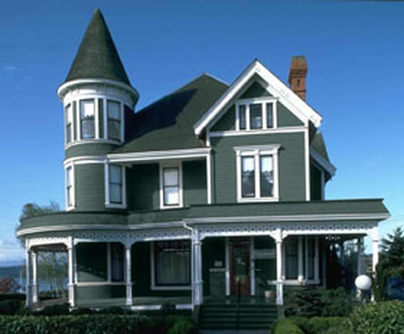
Hold OPTION then click on photo and download it to your PAINT YOUR HOUSE project folder
|
Talk Shape
|
Lesson for Friday, January 19.
Download the file to the right and we will complete it in class |
| ||
Selections
|
Lesson for Wednesday, January 17.
Download the file to the right and we will complete it in class |
| ||
End of Semester
Postage Stamp Series
|
Due at end of class on final Day
Criteria for Stamp Subject Selection. A group known as the Citizens' Stamp Advisory Committee composed of educators, artists, and other experts in their fields recommend subjects and designs to the Postmaster General. In addition, they select the artists who will execute the designs. The following is a simplified version of the Criteria for Stamp Subject Selection which the committee uses in selecting themes and subjects: 1. In general, only American or American-related subjects will be featured. 2. Portraits of living people are forbidden. 3. Commemorative stamps honoring individuals usually will be issued on his or her birthday and no sooner than ten years after the individual's death. However, a deceased United States president can be honored with a memorial stamp on the first anniversary following death. 4. Anniversaries of important historical events will be commemorated in multiples of 50 years. 5. Only events and themes with national significance which appeal to a broad range of people will be considered. Local and regional events are not eligible. 6. Stamps shall not be issued to honor commercial enterprises, products, fraternal, political, sectarian, or service/charitable organizations that exist primarily to solicit and distribute funds. 8. Statehood anniversaries will be considered only at intervals of 50 years from the date of the state's entry into the Union. 9. Religious institutions and individuals whose main achievements are associated with religious undertakings or beliefs are ineligible. 10. Stamps or stationery items with "added values" shall not be issued. It would be difficult to determine which organization should receive the revenue generated from them, because there are so many worthy, fund-raising organizations in existence. 11. Stamps honoring significant anniversaries of universities and other institutions of higher learning shall be considered only in regard to the Historic Preservation Series postal cards. 12. Subjects which have been represented on stamps are eligible only every ten years. Exceptions to this rule include stamps which recognize traditional themes such as Christmas, U.S. Flags, Love, etc. Deliverables 1. Choose one of these categories and build your own series of 3 stamps. 2. Write an explanation on the significance of your series. What does it represent, commemorate etc 3. Write a reflection on what you have learned here and your ability to use the creative process. Create a folder on your google drive for POSTAGE STAMP, keep the finished artwork and 2 written assignments in it, and share the folder. I am looking for your use of color, illustrator effects, type use, masks, command of the pen tool, originality and creativity. |
|
Stamp It!
|
Due Friday, December 1, at end of period
In this tutorial, we’re going to pull out our architect hats and learn how to “build” our very own miniaturized set of New York’s most iconic buildings, using nothing more than the basic shapes and tools that we work with on a daily basis. This tutorial calls for us to make three stamps, but rather just do one and we will save the set for our next project. Deliverables: One of the three stamp designs from the tutorial. Name it the name of the building you choose, and share it to [email protected]. |

| ||
Cartoon TextDue Thursday, November 9, at end of period

To improve our Illustrator skills and build a better understanding of type, shape and the pen tool, We will re-create a dynamic type art.
Download the pdf to the right to get started. Remember to create a new project folder on your computer. |
| ||
Simple Landscape Tutorial
|
Due Tuesday at end of class
Perform this tutorial to gain illustrator skills for the pictogram assignment. |
| ||
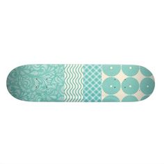
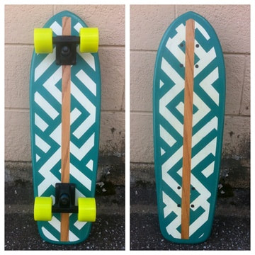
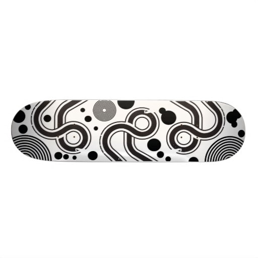
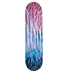
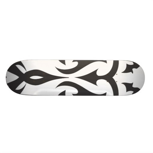
Skateboard Deck Graphics
|
Due Friday, November 3rd, at end of class
Step 1 Download and print worksheet one. Using your knowledge of Line and Shape and Contrast, Draw a composition in each of the 10 boxes. Try to make your drawings show motion and action (fat, thin, wavy, straight, dotted, angular, organic, etc.). Fill the whole rectangle with the design. Take a picture, upload to google drive and share it to [email protected] Step 2. Download and Print Worksheet 2 Draw and refine each of your designs, this time include type into your design. You can use a particular word, (keep it clean) or just use interesting shapes from the letterforms themselves. Step 3. Download the Skateboard template. FILE > OPEN the template document. Once it is positioned on the page, choose SELECT > LOCK > SELECTION Create your best 3 design ideas onto this design template, one must have type as part of the design
|
| ||||||

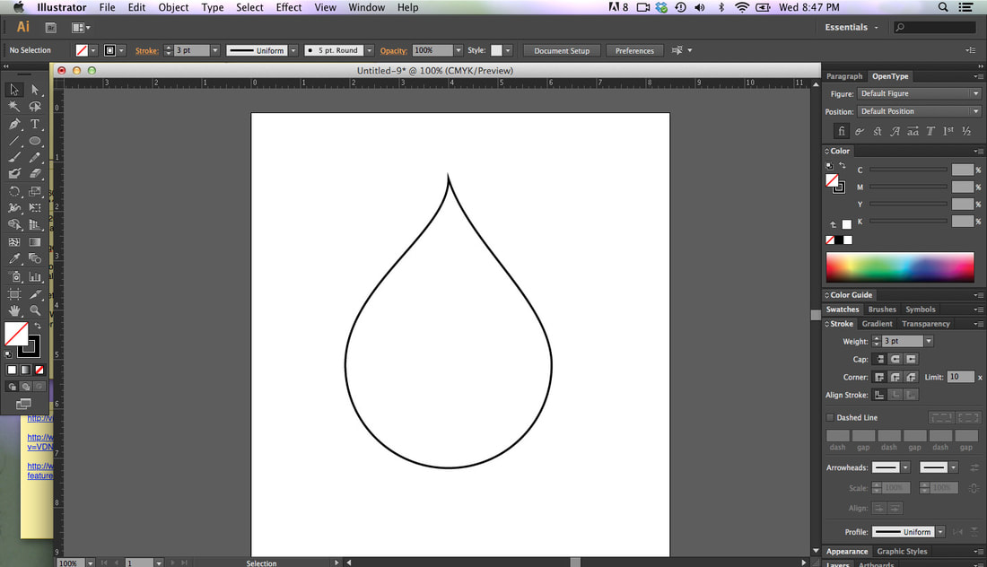
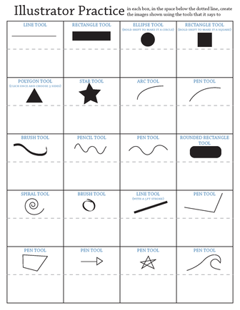
Can You Make This Shape?
|
How was this shape made in Illustrator?
Can you make the same shape? Open Illustrator and try. Activity: Open Illustrator, create a new document at letter size, File > New Go through the tools and take notes on the page as well as follow along in Illustrator using each tool. Look at the Illustrator Tools Overview for what tools should be discussed. Make sure to show how to create curves using the pen tool. PRACTICE 1 This exercise is meant to provide you with practice using the various tools in Illustrator. Check out the attachments to see the process. Before going into the practice worksheet, let students open Illustrator and "play" in the program for 5 minutes. They can explore and use whatever tools they want. After 5 minutes begin the exercise. Before starting the process, students need the "Illustrator Practice 1" document on their computers. It can be emailed to them, given to them on a flash drive, uploaded as a Google Doc and shared with them so they can download it, uploaded to a website for them to download, etc. |
| ||
Jarrett Krosoczka Video
JarrettJKrosoczka_2012X-480p from steve exum on Vimeo.
Due by 11:59, Friday 9/15
View the above video
Once you view it, answer these questions then write a reflection about what you find inspiring about his story.
Questions
1. What were the obstacles that Jarrett encountered as a young child?
2. What people in his life were helpful and kind to Jarrett and how did they make a difference in his life?
3. How did his passion for art help him throughout his life?
4. What is your overall impression of this artist and his story?
Reflection
Relate it to some creative aspect of your life, and describe how it applies to you.
Remember that our reading skill for the month is describe, so be descriptive in your writing.
I need well written sentences and well thought out answers.
Formulate a position to take about what inspired you and why that is important to you, and support it in your writing.
Copyright Case Assignment
DUE: FRIDAY, September 1, 2017
Benedict.com provides a lot of useful information regarding copyright, patent and trademark rules and regulations. This page also offers stories of documented copyright infringement disputes. The stories are divided into three (3) main categories: movies, music and web.
ASSIGNMENT:
Benedict.com provides a lot of useful information regarding copyright, patent and trademark rules and regulations. This page also offers stories of documented copyright infringement disputes. The stories are divided into three (3) main categories: movies, music and web.
ASSIGNMENT:
- Go to .www.benedict.com
- Explore the disputes in the column on the left titled "Menu" and choose two (2) cases to write about.
- Open your Google account
- Title your Google document “Copyright Case Assignment” and IN YOUR OWN WORDS, give an account (Summary) of the two (2) cases you have chosen.
- Include in your Summary: The parties involved, what they are arguing about and who won the case. If the case is still in court, state that the outcome is pending.
- Download at least two (2) images per story from the Internet to illustrate your stories.
- If you search for “Free Use” or “Royalty Free” images, many sites will come up. It is OK if the images you choose have watermarks.
- You may use Photoshop to edit each of your images but it is not required.
- Insert the pictures into your stories. (In Google: Insert > Image).
- You may resize the photos once you insert them into your Google Doc.
- When finished, save and share your document to [email protected].
Lone Star
|
Due, Friday, September 1 at the end of the period.
I tried to recreate a really cool shape I saw on Pinterest sometime ago that was about some hipster badges. I thought it was a great exercise to learn about LINE and how to build with it in Illustrator. |
| ||
Scavenger Reflection
1. Write A reflection of what you learned during the creative process. Be descriptive.
2. Relate and Apply what you learned to other class assignments you have done.
2. Relate and Apply what you learned to other class assignments you have done.
DIGITAL SCAVENGER HUNT 1
DUE Sunday, August 5, 2017 @ 11:59 pm
Take the words from the word list below, and make a powerpoint/Google Slides presentation. One word per slide.
Find the most outrageous photo to use as an example of the word.
DO NOT USE THE STANDARD TEMPLATES FROM THE PROGRAM. BUILD YOUR OWN MASTER SLIDE!!!!!!!!!!!
You must include your sources! You can make a references section in the back, or include it on each slide as in the example.
This project is about perception, creative thinking and digital media use. Be inspired to show the world through your eyes.
1. Site the definition for each of the words, the phonetic breakdown and the part of speech
2. Find a picture that expresses the essence or the spirit of the word.
REMEMBER- Don’t stop at your first idea. Find the most eccentric way out example of the word. Be creative, use the definition to help you find the most expressive picture you can find…..and have fun with it.
EXAMPLE
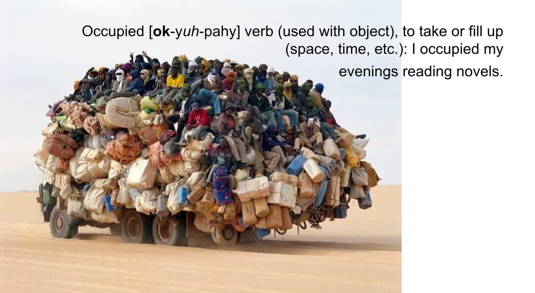
occupied
[ok-yuh-pahy]
verb (used with object), occupied, occupying.
1. to take or fill up (space, time, etc.):
I occupied my evenings reading novels.
Show me a picture that exemplifies this definition. Keeping with the context of graphic design when possible.
Use the word list below
Take the words from the word list below, and make a powerpoint/Google Slides presentation. One word per slide.
Find the most outrageous photo to use as an example of the word.
DO NOT USE THE STANDARD TEMPLATES FROM THE PROGRAM. BUILD YOUR OWN MASTER SLIDE!!!!!!!!!!!
You must include your sources! You can make a references section in the back, or include it on each slide as in the example.
This project is about perception, creative thinking and digital media use. Be inspired to show the world through your eyes.
1. Site the definition for each of the words, the phonetic breakdown and the part of speech
2. Find a picture that expresses the essence or the spirit of the word.
REMEMBER- Don’t stop at your first idea. Find the most eccentric way out example of the word. Be creative, use the definition to help you find the most expressive picture you can find…..and have fun with it.
EXAMPLE
occupied
[ok-yuh-pahy]
verb (used with object), occupied, occupying.
1. to take or fill up (space, time, etc.):
I occupied my evenings reading novels.
Show me a picture that exemplifies this definition. Keeping with the context of graphic design when possible.
Use the word list below
WORD LIST:
BUTTONS RED SQUARE CLUTTER
UNDERNEATH CAN'T LIVE WITHOUT STRIPES CURVY LINES
SOUND EMPTY DELICIOUS UPSIDE DOWN
SILENCE WATER
PATTERN
TOGETHER
PUSH
DEVELOP
PASSION
BUTTONS RED SQUARE CLUTTER
UNDERNEATH CAN'T LIVE WITHOUT STRIPES CURVY LINES
SOUND EMPTY DELICIOUS UPSIDE DOWN
SILENCE WATER
PATTERN
TOGETHER
PUSH
DEVELOP
PASSION
Materials
|
Due August 4th, 2017
|
| ||
Google Account/Inspirational Quote
Due July 31st, 2017
Send me an unbelievably inspirational quote from your google account, and include an explanation as to why it is important to you.
Be sure it is an account with your name in it. I wont know who [email protected] is.
This must be a gmail account, not yahoo, hotmail or anything else, just gmail.
Send me an unbelievably inspirational quote from your google account, and include an explanation as to why it is important to you.
Be sure it is an account with your name in it. I wont know who [email protected] is.
This must be a gmail account, not yahoo, hotmail or anything else, just gmail.
Donated Items List
List of Items to Donate
Tissue Box
Disinfectant Wipes
Hand Sanitizer
Paper
Towels
UHU Glue Sticks (jumbo/Large)
Scotch Tape
Tissue Box
Disinfectant Wipes
Hand Sanitizer
Paper
Towels
UHU Glue Sticks (jumbo/Large)
Scotch Tape
2017/18 Submit Forms
|
Expectation Contract
Internet Use Contract Computer Art Syllabus Due JULY 31st, 2017 Download it from the docs to the right, print it out, and have both you and your parents sign it, then turn it in on or before July 31st, 2017 |
| ||||
Self Yourself
|
You will investigate the concept of “self” by confronting your thoughts, beliefs and even yourself in search of creating meaningful images that represent an authentic insight into your self.
SELF ONE (30 pts.) Due Wednesday, May 10 “iSpace” Self Portrait Social networking sites have created a new genre of self-portraiture, as people decide the self they want to portray online. 1A. Begin by reading the Here I Am article posted to the right. 1B. Finish by writing a reflection about the article and about how you chose to portray yourself. Download the reflection form to the right and answer the questions in your reflection. 1C. Then, using a digital camera or your phone, create your own original self-portrait that you feel reveals your personal identity. Think about your pose, your mood, the colors you are wearing, and the composition of your photo. Remember the elements and principles of art. Edit the picture in Photoshop, adding any enhancements you feel will add to your personna being captured. 1D Submit it with a written description of how this portrait represents you and what you are trying to show about yourself through this portrait. SELF 2 (50 pts.) Due Wednesday, May 17 “Profile” Self Portrait 2A. Take a digital picture of yourself from the side against a plain background like a wall. Using Photoshop, remove your face, leaving the background and outline of your face. Fill the background with black or a textured picture. Fill your face with images that represent you and have meaning to you. 2B Submit it with a written description of how this portrait represents you and what you are trying to show about yourself through this portrait. SELF 3 (30 pts.) “Inner Self” Slide Show STEP ONE: you will complete several photo shoots throughout this process. The initial few shoots will concentrate on identity within the context of self and build a tangible sense of self-awareness. Begin by concentrating on yourself and how YOU see yourself. SHOOT #1: Use props and backgrounds to help convey a sense of who you are. Refine your expression of an authentic self. You should concentrate on your perception of yourself or your “hidden self”. 1B Submit it with a written description of how this portrait represents you and what you are trying to show about yourself through this portrait. SHOOT #2: You will now focus on the way that others perceive you. Visually articulate the way that you are perceived by others. 2B Submit it with a written description of how this portrait represents you and what you are trying to show about yourself through this portrait. STEP TWO: Once you have expressed an idea of who you truly are, you will start to investigate how self-concept is inter-related with experience. During this part of the process, you will concentrate on how socialization and enculturation within a society are internalized by the individual, thus becoming elements of self. SHOOT #3: Shoot a cultural articulation of your authentic self. Explore the influential relationship that culture has on you and visa versa. You should use props, compositional elements, lighting schemes and posing to communicate your vision of culture and self. 3B Submit it with a written description of how this portrait represents you and what you are trying to show about yourself through this portrait. The final product you will create a slide show of the various pictures you have taken. There will be 5 pictures minimum, with at least three pictures from each shoot (preliminary or other shots for this that you didnt end up using for the final selection). Include all of the reflections for each portrait. Write a final reflection about what you discovered during this process both about yourself, and about your abilities. Pictures should smoothly transition from one to another. You can use either Google slides or PowerPoint to present your slideshow. All images should be edited in Photoshop, and then saved as .jpg. |
| ||||
To Vector From Pixel
|
Making a Line Drawing from a Photo
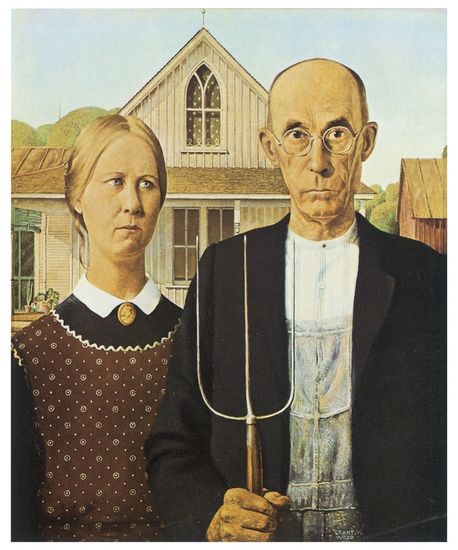
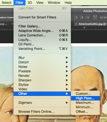
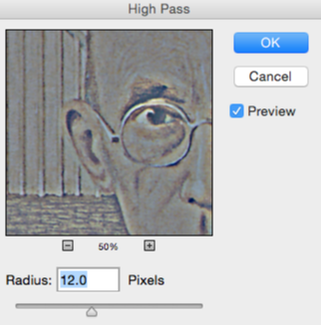
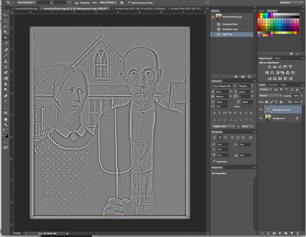
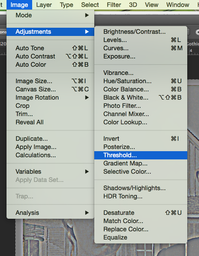
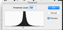
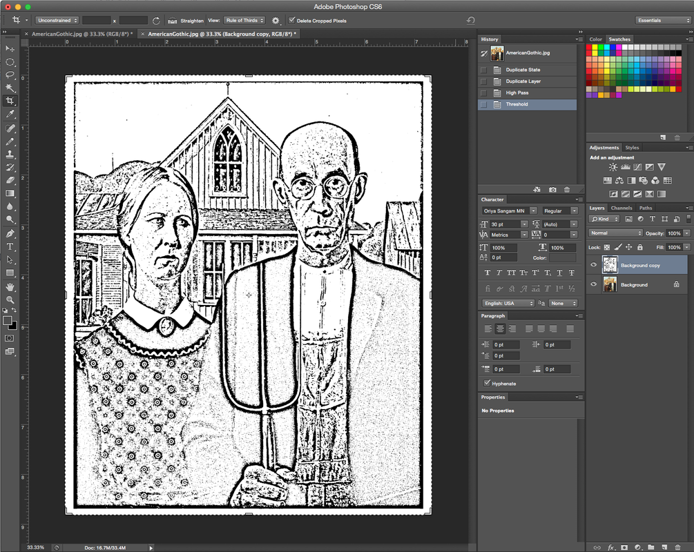
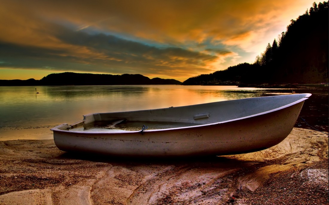
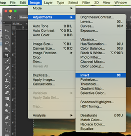
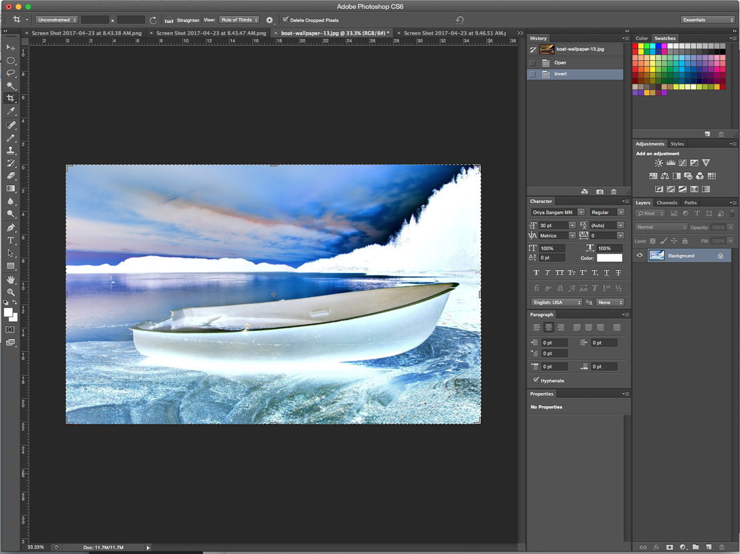
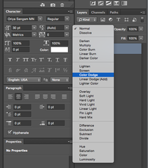
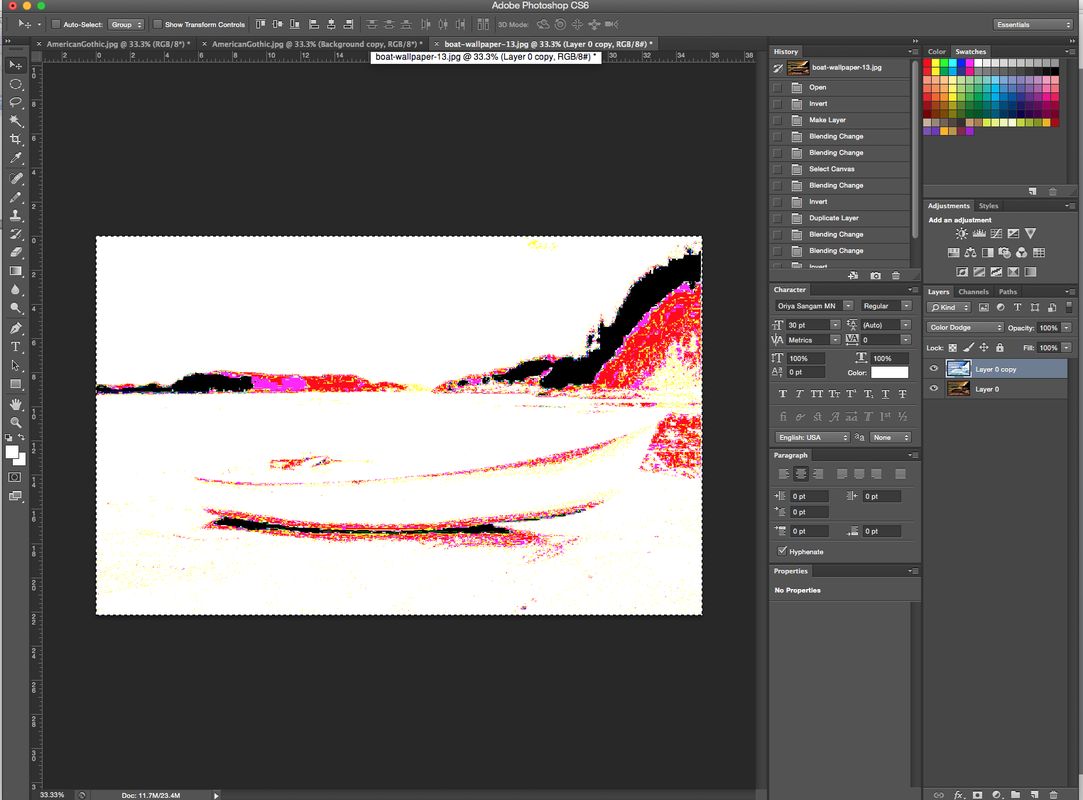
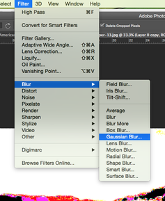
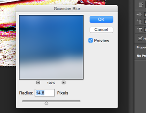
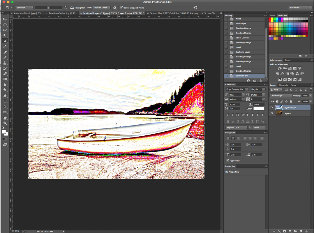
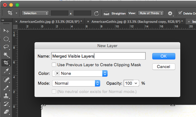
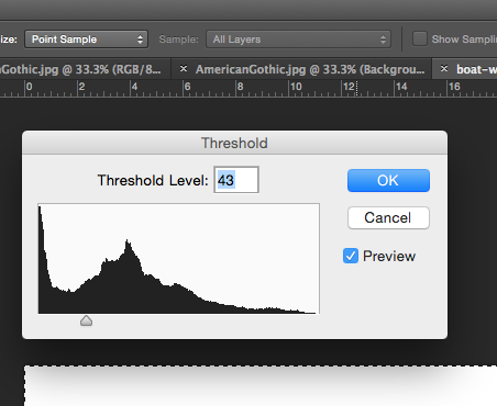
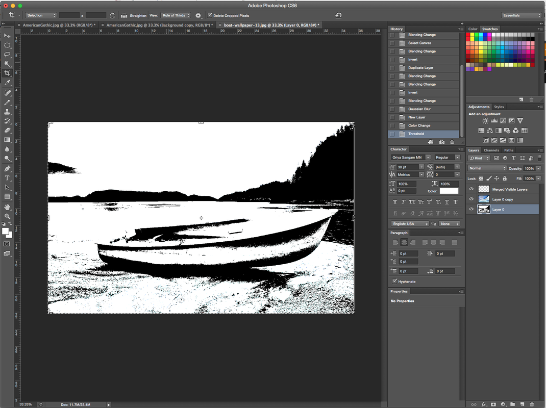
In this tutorial, you will work with some interesting filters and techniques to create a line-drawing from a photo. There are several ways to achieve a similar effect and though my result is good, in my not so humble opinion, this might not be the easiest or the "best" way to accomplish this. As you work through this tutorial, you will get some practice with using some nifty filters and techniques, some of which may be new to you. These include sharpening with the unsharp mask filter, working with the high-pass filter, and using hue/saturation, threshold, and levels adjustments. Relevance "But what is this good for?" I hear you asking. Well, some people just like the effect. But this is also good in commercial/business uses for making monochrome vector art. Step 1 If you want to use the photo of the famous Grant Wood painting "American Gothic," you can click on the one at the right, then select "Save as." Put it in your project folder titled “To Vector From Pixel” and name it something clever and memorable like, perhaps, "American Gothic." Step 2 The next part uses a filter that I'll bet you have not used. It is the "High Pass Filter." This filter works by keeping the edge details where distinct color transitions take place while graying the rest of the image. Let's try it. First duplicate your layer by dragging it to the new layer icon at the bottom of the layers palette, or by choosing LAYER > DUPLICATE LAYER. This is in case you really need to start over. Next, click on FILTER -> OTHER -> HIGH PASS. At the right is the dialog box as it appears. If you want JUST the edges, you can choose a very low radius number, all the way down to 0.1 pixels. I chose 12.0 here. Be sure that "Preview" is checked and then slide the slider up and down to see what it does. To the right is my result after this step. Step 3 Now we need to adjust away the gray. You could do this with Adjust -> Contrast, but I want you to use Threshold instead. This gives you better control over your result. So click Image > Adjust > Threshold and pull the slider till your result is just the outlines, as in my result to the right. As i mentioned before, there are many ways to accomplish a similar result. Herewith follows a method which you may want to try. Step 4. Download the boat file to the right, and save it to your project folder. Open it in photoshop. Duplicate your layer by dragging it to the new layers icon at the bottom of the layers palette, or by choosing LAYER > DUPLICATE LAYER from the main menu. Choose Image > Adjust > Invert from the main menu. This gives the boat a somewhat creepy look. Now this next part seems like a trick, but follow along. With the inverted layer selected in the layers palette, you are going to change the layer blending mode of this layer to Color Dodge. You do this by selecting Color Dodge in the dropdown that you get by clicking the arrow at the top of the palette right beside where it now says "Normal." Ok well now that last step just got us a mess, basically. Now comes the magic. With your top layer selected in the layers palette, click Filter > Blur > Gaussian Blur. For mine, I used the settings in the dialog box to the right. Your result should resemble mine to the right. Make a new layer, by clicking the Create a New Layer icon at the bottom of the Layers palette, or by choosing LAYER > NEW LAYER from the main Menu. Name your Layer MERGED VISIBLE LAYERS At this point, you have a rather nice colored pencil-type drawing. But now we will redefine all of these colors, so that they are either black or white. Image > Adjustments > Threshold. And here is the result! To Finish converting to a vector graphic, follow these steps 1. Convert the picture mode into Grayscale mode. 2. Make the image size grow by resampling the image resolution to 1500 DPI! (Why this big resolution? The answer is to have enough anchor points for the next step.) 3. Using Magic Wand tool, select any BLACK pixel. (Zoom in if necessary to distinguish a black pixel from a white pixel.) 4. From Select menu choose SIMILAR. 5. From Paths palette, and while the selection ants are alive, make a working path by clicking the tangents-and-circle icon beneath. 6. From File menu Export > Paths to Illustrator. The exported file will hold the same PS file name with .ai extension. 7. From Adobe Illustrator, open the artwork file, then SELECT > All. 8. From pathfinder filters, choose the filter Exclude. 9. Fill with any paint, and you are done with the vector version of the original photo. 10. You may save the artwork into EPS. It is interesting to open the same EPS with Photoshop, and see how smooth it is! |
| ||
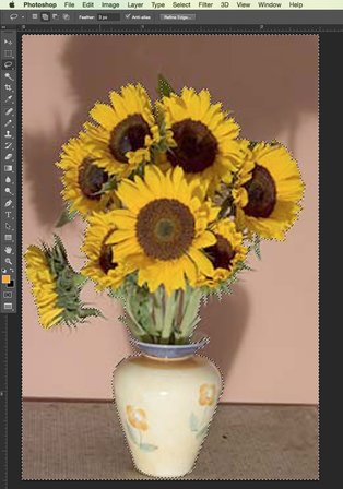
"the Van Gogh Effect"
|
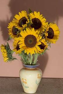
In the late 1880s, Dutch painter Vincent Van Gogh created his most famous works in a brief period while living in Arles, in southern France. These included Provençal landscapes, indoor scenes, and vases of sunflowers.
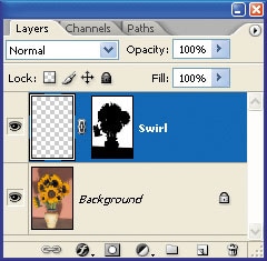
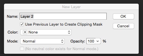
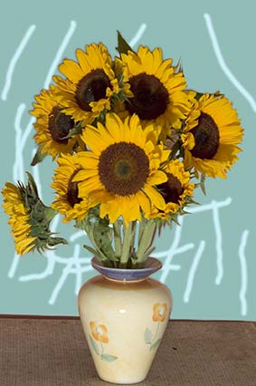
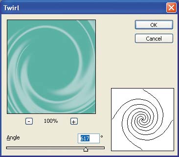
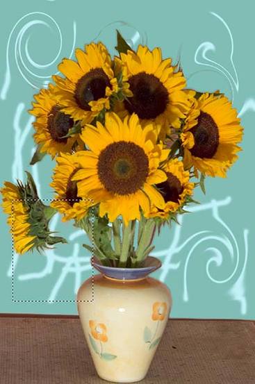
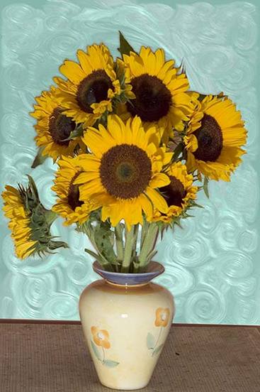
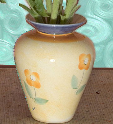
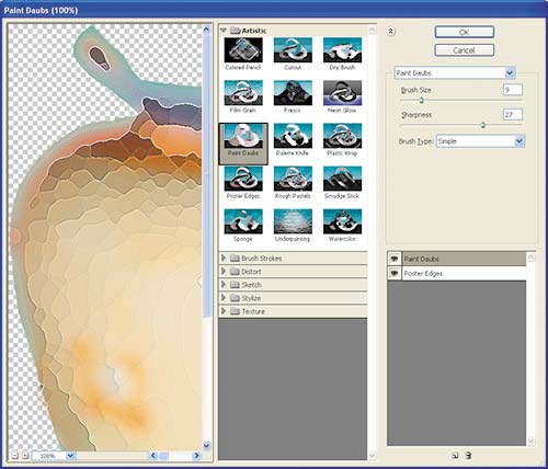
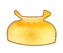
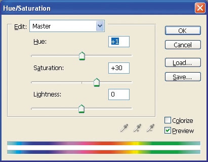
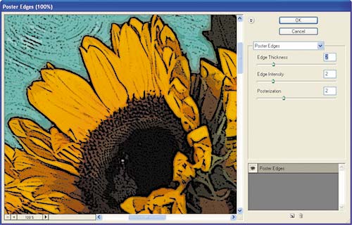
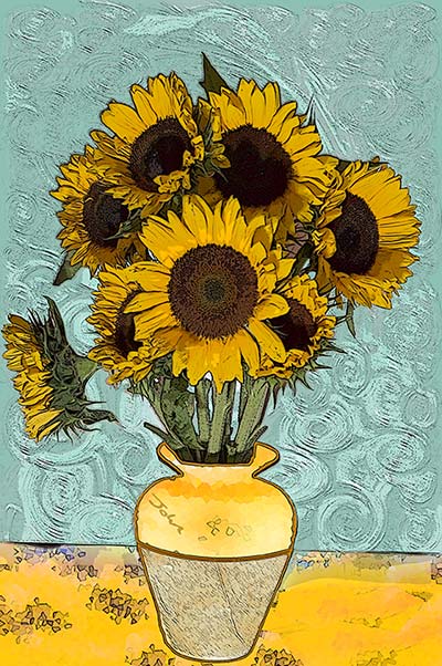
Influenced by Impressionism and Post-Impressionism, as well as by Japanese art, Van Gogh’s style is distinct and instantly recognizable. His work is characterized by thick swirls of solid color, as can be seen in many of his skies, but he also painted poplar trees and fields of waving crops. In his sunflower paintings, Van Gogh limited his palette to golds, mustards, and contrasting blues, and he tended to compose the images within tight framing in order to focus the eye. The thick swirls form a backdrop for the slightly scruffy, withered petals of his flowers, outlined in prominent black lines. My local flower store only had fresh sunflowers, nothing as old or wilted as van Gogh’s subjects, but I emulated the style of the painting by making one stem droop away from the bunch. I placed the vase on a low table against a simple, contrasting background that would be easy to remove digitally. Using a short zoom lens, I used an angle of view similar to van Gogh’s for a striking composition. STEP 1 To create a contrasting background, select and remove the existing background with the Magic Wand. Set a low tolerance and click a pixel typical of the area. Hold down Shift to add other pixels (or Alt/Opt to subtract them) from the selection. STEP 2 When the selection looks correct, click the “Add a new layer” icon in the Layers palette and immediately click the new layer’s “Add layer mask” icon. This layer will be used for painting a new swirling background; the mask will protect the sunflowers underneath. STEP 3 Click the chain between the thumbnail and the mask to unlink them. This stops later steps from affecting the mask. STEP 4 Set the foreground color to turquoise, mustard, or a deep shade of blue, and fill the layer with Edit > Fill. Use the Brush tool to paint onto the layer, but use a slightly different shade of the same color. There is no need for artistic skill—random strokes will be fine. STEP 5 Choose the Marquee tool (shortcut M) and select an area—the smaller the area, the tighter the swirls will be. From Photoshop’s Filters menu, select Distort > Twirl. As you drag the Angle slider, you see a preview of how Photoshop will twirl the selection. When you are happy with the result, click OK. STEP 6 Make a new selection and apply the Twirl filter again. Here, I have already applied the filter to areas above the flowers and to their right, and have moved the selection marquee, ready for another twirl. Repeat this process until every part of the background has been affected. Save time by using Ctrl/Cmd + F, which reapplies the same filter settings, or use Alt/Opt + Ctrl/Cmd + F to reopen the dialog box and change the angle. STEP 7 If your vase and tabletop are as unsuitable as mine, activate the Magic Lasso, zoom in, and select them by dragging around them. Use Ctrl/Cmd + J to copy them into their own layers. STEP 8 With these elements in separate layers, you can safely experiment. Paint randomly with the brush, or choose Filter > Filter Gallery, click the “New effect layer” icon at the bottom right of the dialog, and apply multiple filters simultaneously. Here, Poster Edges was perfect for creating cracks on this vase, while Paint Daubs smudged the colors. STEP 9 Van Gogh’s vase had a line halfway across, so I selected the top of my vase and added a strong border using Edit > Stroke. I also used Image > Adjustments > Hue/Saturation to fine-tune the color, then used other settings on its lower half. The top was gold, the base beige. STEP 10 Van Gogh usually gave every detail an edge. As all the image elements are on different layers, it’s easier to merge them onto a new layer before proceeding. Hold down the Alt/Opt key and select Merge Visible from the Layers palette menu (if you are using Photoshop CS or earlier versions of Photoshop, you should first create a new layer). Then select Filter > Artistic > Poster Edges. Turn the Posterize slider down, and adjust the edges to match the image. I used low values. For a final touch, place your signature in the same position on the vase as Van Gogh did on the original sunflower paintings. |

| ||
Change Color Exercise
|
1. Download both images from the right and save them to a new REPLACE COLOR folder in your name folder on your desktop.
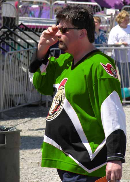
2.Open replace1.jpg and replace2.jpg images in photoshop. 3. Choose Image > Adjustments > Replace Color... 4. Change red color on man's shirt, and flowers To use the Color Replacement Tool: 1. Select the Color Replacement Tool in Photoshop 2. Choose a brush tip in the options bar. Generally, you'll want to keep the blending mode set to Color 3. For the Sampling option, choose one of the following: Continuous to sample colors continuously as you drag Once to replace the targeted color only in areas containing the color that you first click (use color picker first) Background Swatch to erase only areas containing the current background color 4. For the Limits option, select one of the following: Discontiguous to replace the sampled color wherever it occurs under the pointer Contiguous to replace colors that are contiguous with the color immediately under the pointer Find Edges to replace connected areas containing the sampled color while better preserving the sharpness of shape edges 5. For tolerance, enter a percentage value (ranging from 0 to 255) or drag the slider. Choose a low percentage to replace colors very similar to the pixel you click, or raise the percentage to replace a broader range of colors. 6. To define a smooth edge to the areas you correct, select Anti-aliased 7. Choose a foreground color to use to replace the unwanted color 8. Click the color you want to replace in the image 9. Drag in the image to replace the targeted color |
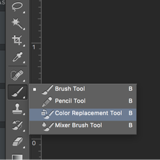
Fig 1
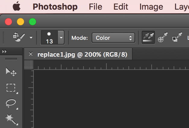
Fig 2
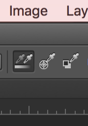
Fig 3
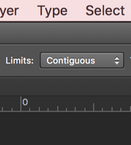
Fig 4
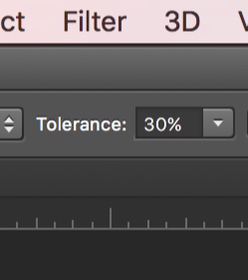
Fig 5
| ||||||

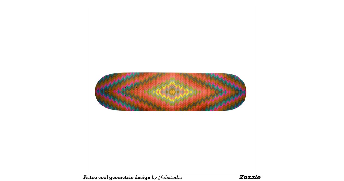
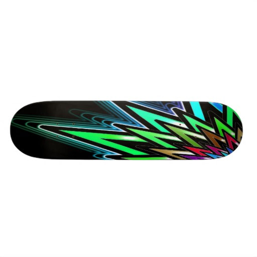
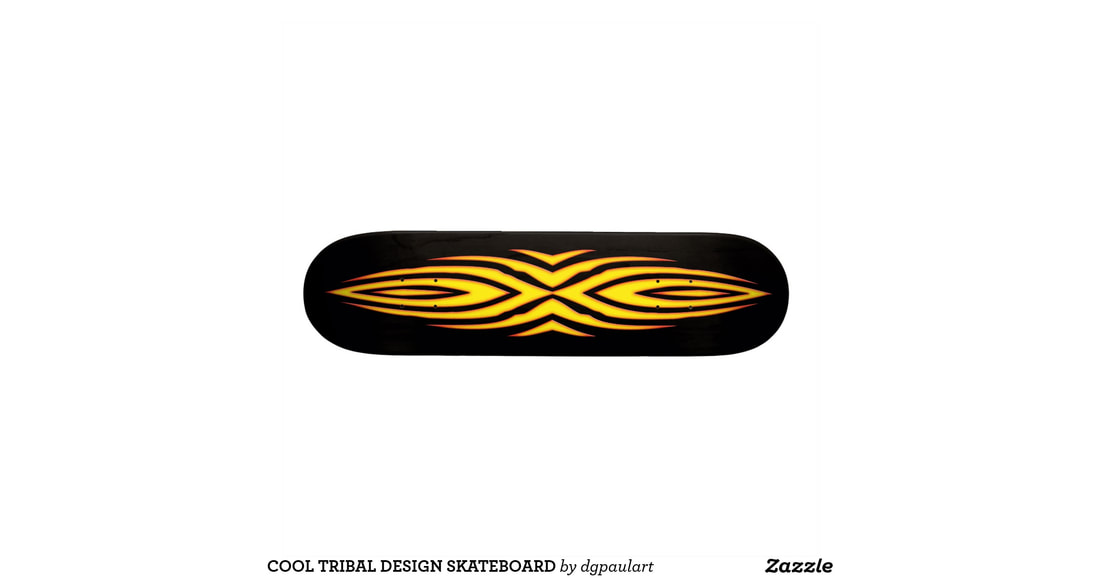
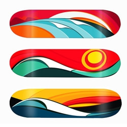
Skateboard Deck Graphics
|
Due Friday, March 9 at end of period.
Step 1 Download and print worksheet one. Using your knowledge of Line and Shape and Contrast, Draw a composition in each of the 10 boxes. Try to make your drawings show motion and action (fat, thin, wavy, straight, dotted, angular, organic, etc.). Step 2. Download and Print Worksheet 2 Using your best three designs from worksheet one, redraw and refine each of your designs, this time include type into your design. You can use a particular word, or just use interesting shapes from the letterforms themselves. Step 3. Download the Skateboard template. Import it to Illustrator or Photoshop (Your Choice). Recreate your best 3 design ideas onto this design template |
| ||||||||||
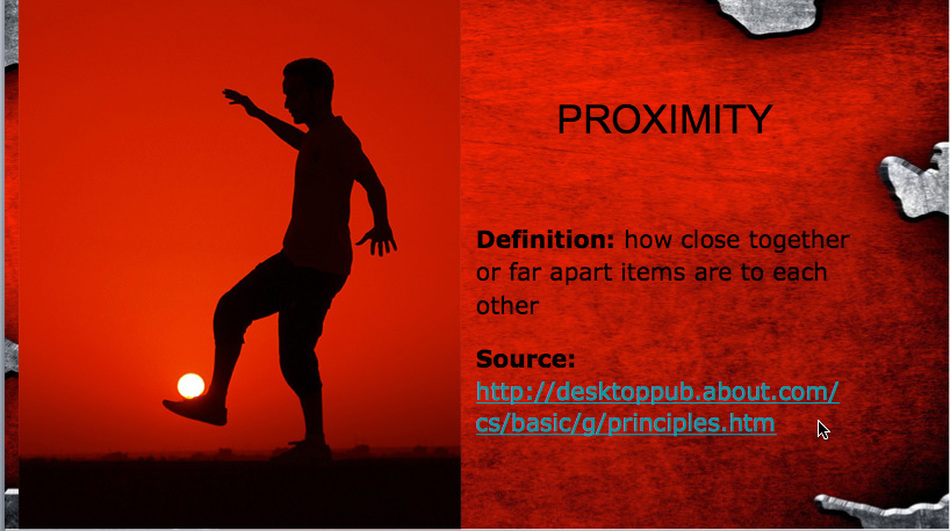
Scavenger Hunt 3
Due Friday, February 24 at end of period.
Take the words from the word list below, and make a powerpoint/Google Slides presentation. One word per slide. Find the most outrageous photo to use as an example of the word.
DO NOT USE THE STANDARD TEMPLATES FROM THE PROGRAM. BUILD YOUR OWN MASTER SLIDE!!!!!!!!!!!
You must include your sources! You can make a references section in the back, or include it on each slide as in the example.
This project is about perception, creative thinking and digital media use. Be inspired to show the world through your eyes.
1. Site the definition for each of the words.
2. Find a picture that expresses the essence or the spirit of the word.
REMEMBER- Don’t stop at your first idea. Find the most eccentric way out example of the word. Be creative, use the definition to help you find the most expressive picture you can find…..and have fun with it.
EXAMPLE
proximity [prok-sim-i-tee]
noun
1. nearness in place, time, order, occurrence, or relation.
Although his presence was sporadic and invisible, just the thought of hisproximity delighted and intimidated me.
Show me a picture that exemplifies this definition. Keeping with the context of graphic design.
Use the word list below:
1. Background
2. Capture
3. Compression
4. interactive
5. Script
6. navigation
7. rollover
8. treatment
9. negative space
10. texture
11. proof
12. form
13. unity
14. proximity
15. Saturation
Metamorphosis
|
met·a·mor·pho·sis (mĕt'ə-môr'fə-sĭs)
A transformation, as by magic or sorcery. You will use your magical powers and the tools in Photoshop to create a new animal by combining two or more together. The idea is to blend them so seamlessly that one cannot tell it has been created in Photoshop. Study the colors in the body of one vs the head of another. Can you make the two into one with out seeing the seem? You'll also want to combine two that creates a believable animal. Possible tools:
Rubric: Craftsmanship (10 pts) Transitions/Edges (10 pts) Realism ( 5 pts) Creativity ( 5 pts) TOTAL (25 pts possible) |
|
Juxtaposing your portrait into famous artwork
|
Due at end of class Thursday, February 2.
Select a painting from the list of the top 100 famous paintings. You may find the image on the Internet if you can, find a large file. Use digital cameras to take photos of yourself in a way complementing the artwork. Students must use filters, tools and blending options to juxtapose themselves seamlessly into the artwork. Before taking photographs, it is critical to know what painting you are going to be working with to try to match the pose and lighting. Experiment with various filters to achieve a similar "brush stroke" to the original image. If you need quick visual references or a place to get ideas, the following Internet sites are helpful. (www.artchive.com or www.artcyclopedia.com) This is a great resource for altering color in Photoshop. Of course, you will still need to apply filters to make your face look like it was supposed to be there. |
|
Emphasis
|
Due at end of class Thursday, January 25
Please download the exercise handout to the right, and complete your task for emphasis. Remember that the whole point of emphasis is to make a dramatic effect to the photo that creates an emphasis or focal point. When you are done, upload your files to your google drive and share them to [email protected] |
| ||
Selections
|
Due at end of class Thursday, January 25
Please download the exercise handout to the right, and complete your the various selections. When you are done, upload your files to your google drive and share them to [email protected] |
| ||
Tile Pattern
|
Due at end of class Monday, January 23
Repetition and Pattern In this project you will create a repeating pattern design, by creating a simple design then duplicating and rotating it several times. The objective is to create a pattern with just a few parts. By repeating the shapes, you will create a pattern that presents a sense of rhythm as well as movement. Objective Understanding what layers are and how to use them effectively. Using math skills to reduce and increase the work area. Understanding the Principles of Design by using Repetition to create Rhythm Using creative thinking skills to figure out how to create an interesting design. Download the file to the right to get started |
| ||
Talk Shape
Due at end of class, Friday the....well, you know!
BASIC:
Creating the Talk Shape for dialogue –
TIP: If you wish to change the Text Instead of the Talk Shape - Select the Text layer in the Layers Palette. Double-click on the text in the Document Area. You may now change your text.
ADVANCED:
Creating a Path (Outlining) –
BASIC:
Creating the Talk Shape for dialogue –
- Open Photoshop.
- Choose File > New.
- Make the file pretty large, 1000 x 800 ppi.
- Name your file “Talk Shape.”
- Choose the"Rectangle Tool" from the tool box, right above the hand tool. Click and hold on the tool so the Pop Up window appears. Choose "Custom Shape Tool"
- About midway accross the Options bar at the top, is the Shape Picker. Click the downward facing triangle and the shape choices will appear.
- Choose the Talk Shape.
- Choose a Foreground color.
- In the Document area, drag out the Talk Shape. Make it large enough to hold the amount of text you plan to type.
- TIP: To change the direction of the stem use Edit > Transform Path > Flip Horizontal.
- Select the Type Tool.
- In the Character Palette, choose the font, font size, line strength, paragraph orientation and color.
- When you click in the Document area a New Type Layer will form in the Layers Palette.
- Type your message.
TIP: If you wish to change the Text Instead of the Talk Shape - Select the Text layer in the Layers Palette. Double-click on the text in the Document Area. You may now change your text.
- Save - Command-S
ADVANCED:
Creating a Path (Outlining) –
- Activate the Shape Layer in the Layers Palette.
- Open the Paths Palette. Notice the Shape Layer is a vector Layer.
- In the Paths Palette, click and hold the Shape 1 Vector Mask and drag it down to the Create New Path icon located at the bottom of the Paths Palette (next to the trash can) to duplicate it. Path 1 will be created.
- Choose the Shape tool.
- Use Command-T to select Free Transform.
- Drag the box outward. A line will appear around the Talk Shape. (Holding Shift while dragging will keep the proportions and the transformation centered.)
- Hit enter to transform your path.
- Click on the Layers tab to return to the Layers Palette.
- Make a new layer by clicking on the New Layer icon (bottom right of the Layers Palette next to the trash can).
- Choose the outline color you wish to use as your Foreground color.
- Select the Paintbrush in the Tool Box.
- In the Options bar, choose the width of the brush. To create solid lines use a hard-edged (dot) brush.
- In the Paths Palette select the Stroke Path button (second from the left). Your path will be drawn using your selected Foreground color.
- Click in the Paths Palette below your path, in an empty space, to deselect the active path and make the path line in your image disappear.
- Save - Command S.
SEMESTER BREAK
PowerPoint Final
Due at end of class on the day of your final
Present your design projects with a Powerpoint Presentation.
Creativity: Remember that completing the minimal project requirements will earn C work. Adding more information, pictures, descriptions/explanations etc that are relevant and serve to a better understanding for the audience will earn the higher grades. So push past your first attempt, and dig deeper for the more solutions. This is a "design" project, so give it your best shot at being aesthetically pleasing. Create your own background template.
Include:
Title Slide: Your Name, Period #, Fall 2016
Slide 2: Broker Sign
Slide 3: Movie name. Include your overview that explains what your movie of choice is about, main characters, themes etc that you will show in your visual solution.
Slide 4: Include your 5 sketches for that show
Slide 5: Include your final pictogram for that movie.
Slide 6-11: Repeat steps 3, 4, and 5 for each of the remaining 2 movies.
Slide 12: Include your badge logo
Slide 13; Include your furry Monster
Slide 14: Relate and Apply what you learned about the creative process to how it can help you in future projects or assignments in other classes.
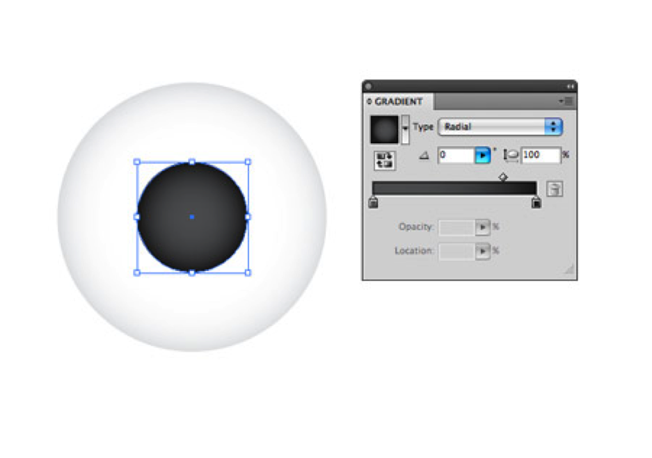
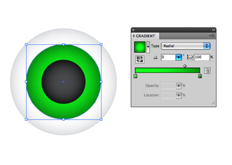
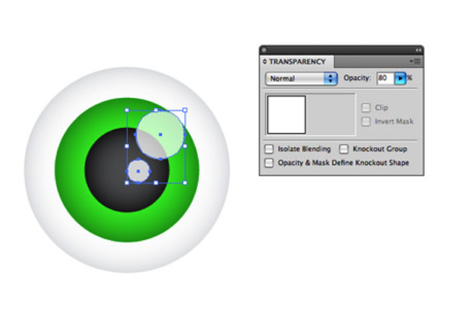
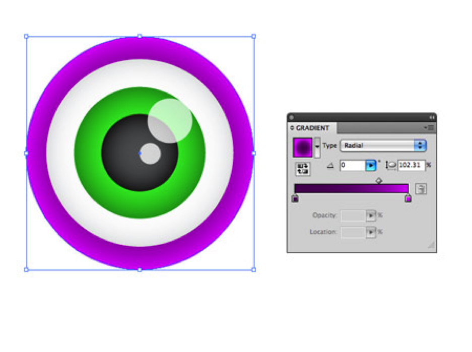
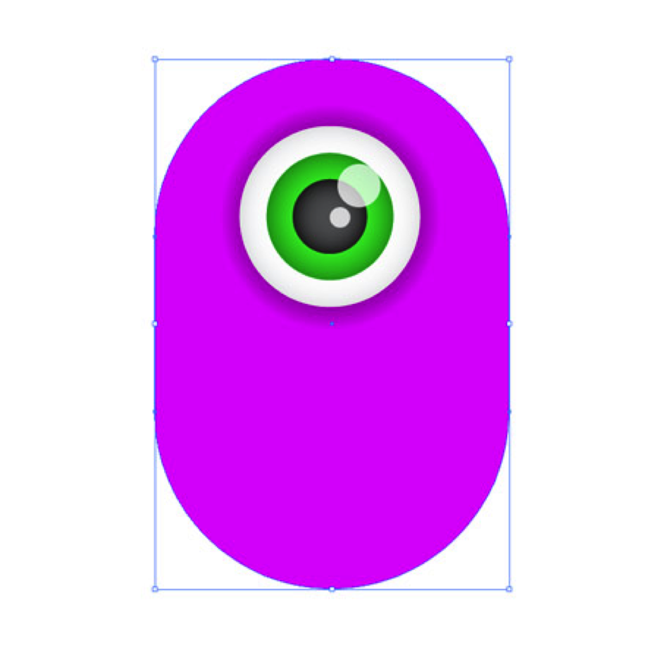
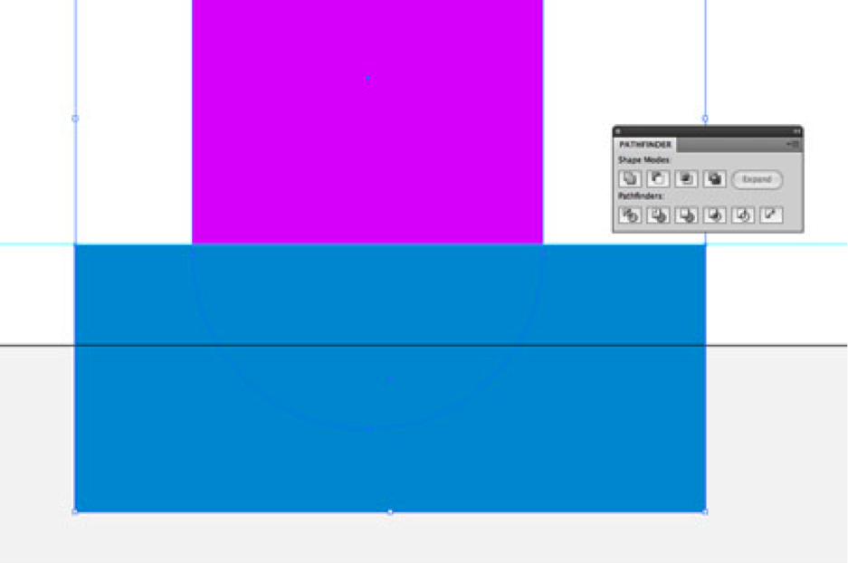
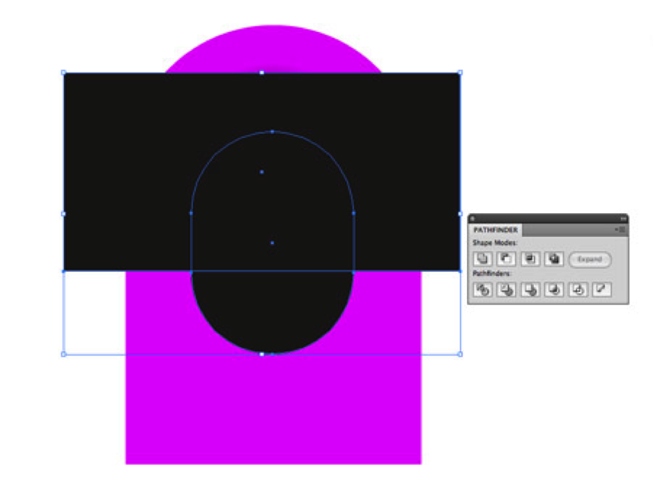
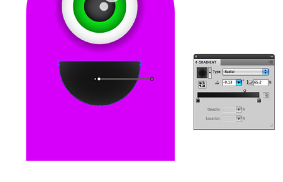
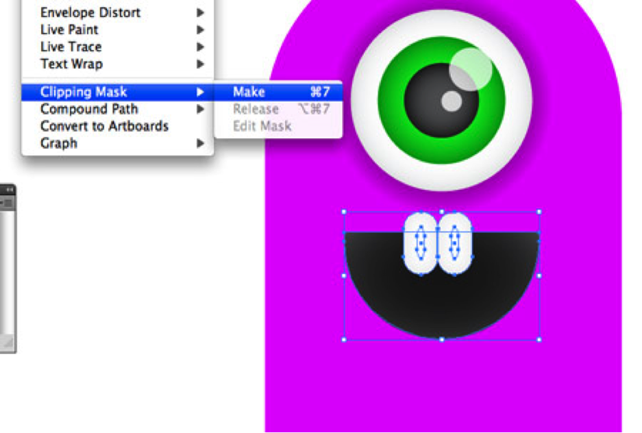
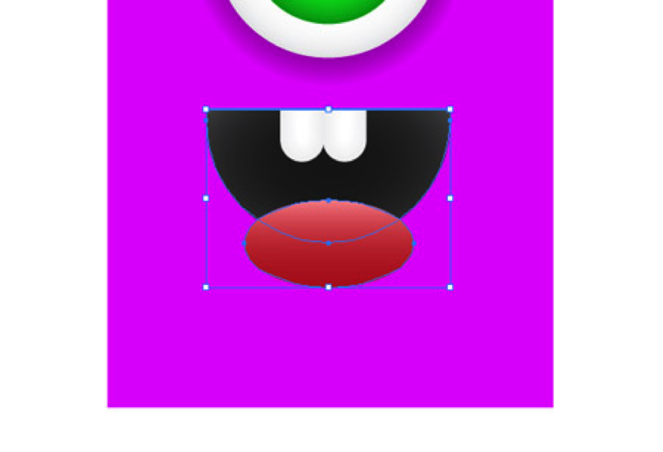
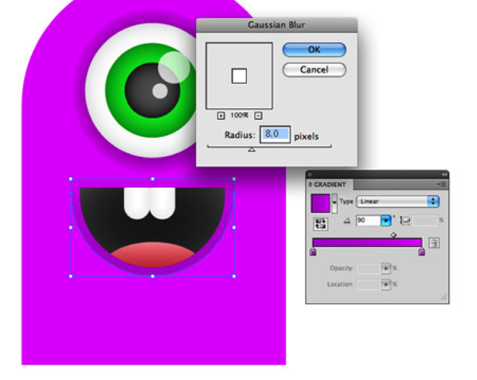
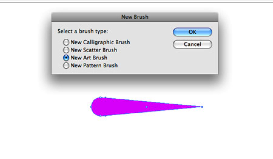
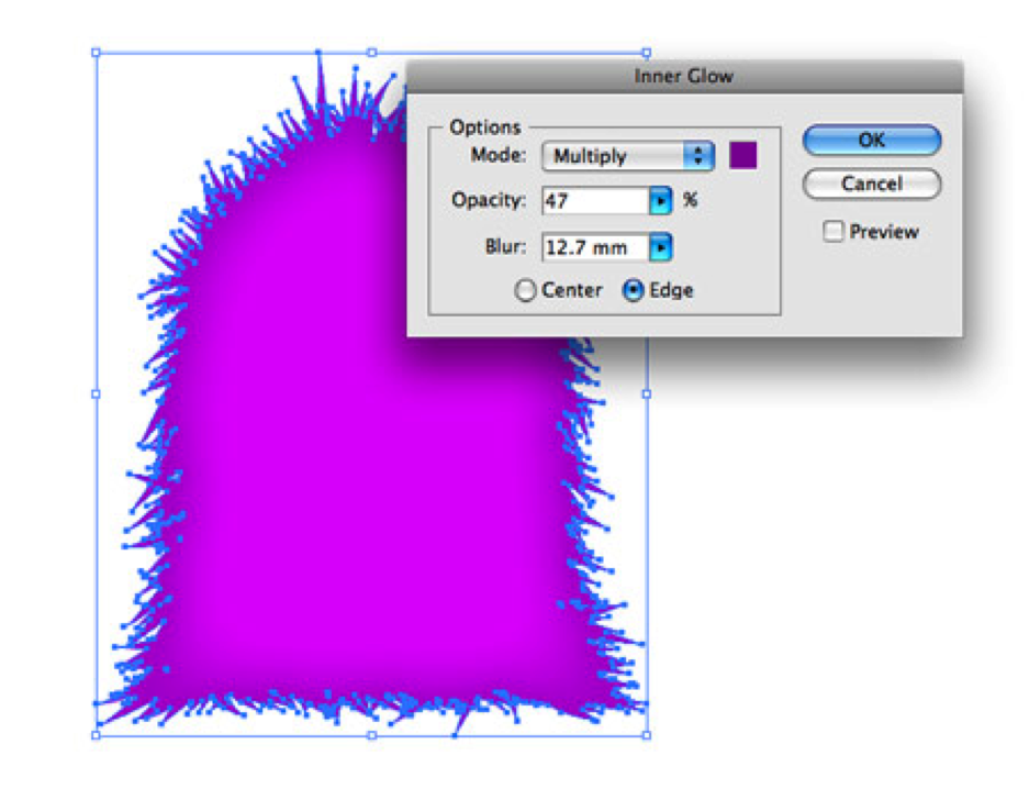
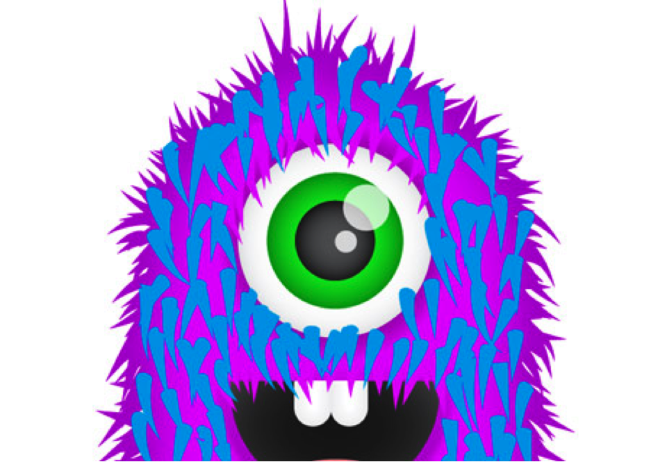
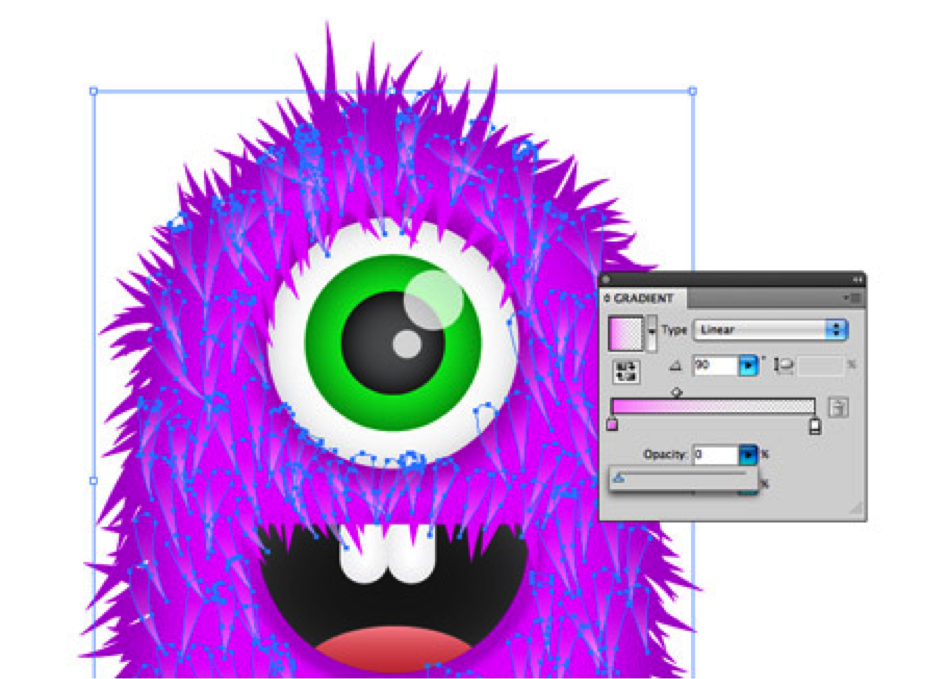
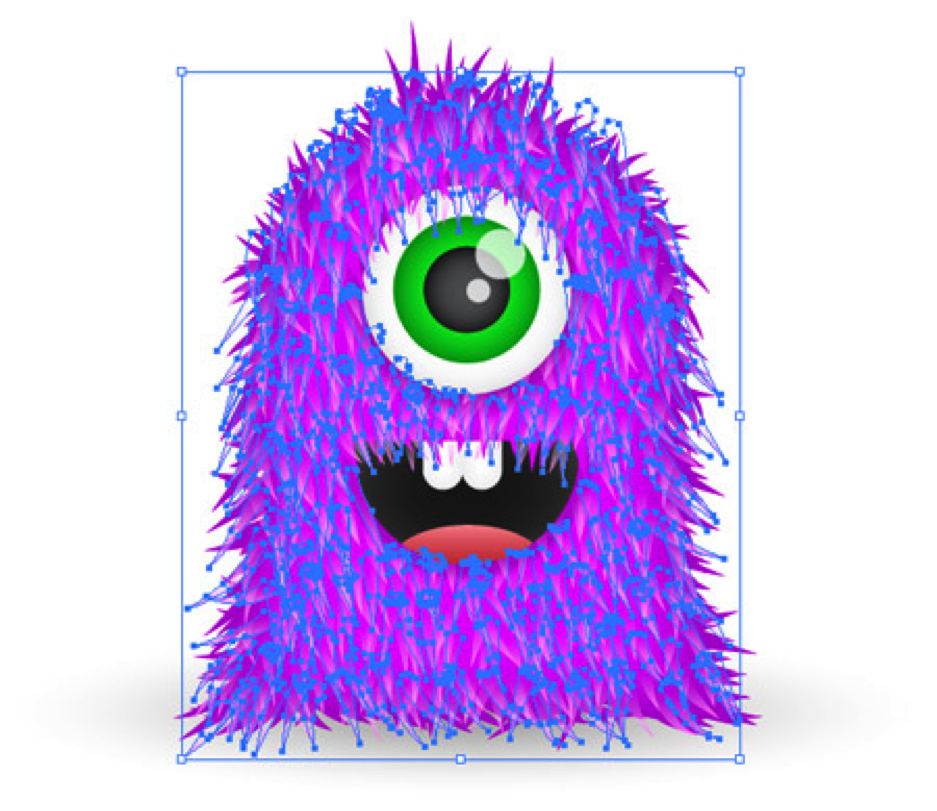
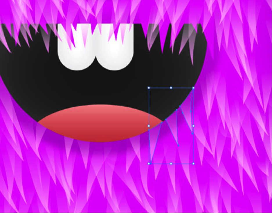
Furry Vector Monster

|
Due Monday, December 5, at end of class.
Follow these steps in Adobe Illustrator to create your very own super cute fuzzy monster character. We’ll be working with the basic shapes to start, then use a variety of gradients to add depth. We can then finish it off with some detailed fur effects to really lift the design from the screen. Start work on the eyeball, draw a perfect circle on the artboard. Hold Shift to keep things in shape. Add a simple radial gradient spanning from grey to white. Adjust the gradient sliders so that the grey creeps in slightly from the edges of the circle. Copy (CMD+C) and paste (CMD+F) the circle, scale down while holding Shift and Alt, then swap the gradient out for a couple of darker greys to form a pupil. Repeat the process, but this time scale down the circle into position as the iris. Choose a nice bright colour for the eye, such as green. Switch the gradient to a dark and light tone of your chosen colour. Draw a couple of specular highlights in the form of circles. Drop the opacity down to 80% to allow the underlying elements to show through. Paste in one more circle, this time scale it up, and add a gradient from dark to light purple. The outer colour will blend into the main body, which will also be filled with this purple swatch. Draw a huge rounded rectangle onto the artboard to form the basic body shape. Alter the curvature of the corners by using the cursor keys while dragging. Align everything up centrally down the vertical axis. Draw a temporary shape that covers the bottom curve of the rounded rectangle. Use the Subtract from Shape Area option in the Pathfinder window to chop out the excess. To extend this flat edge, drag it downwards while holding Shift with the Direct Selection Tool. Draw another rounded rectangle, this time to form the smiling mouth. Use another temporary tool and the Pathfinder palette to chop out the unwanted area, leaving a flat top edge. Fill the mouth area with a radial gradient, fading it from grey to black adds a nice touch of depth, which would otherwise be a flat black colour. Draw a couple of goofy teeth using the rounded rectangle tool. Copy the mouth shape, send it to the front (CMD+Shift+]), then use it as a Clipping Mask to hide and crop the teeth into place. Draw a red oval to form a cheeky tongue, filled with a pink to red gradient. Use another Clipping Mask to hide the unwanted overlap. Select the mouth shape, then go to Object > Path > Offset Path. Fill the new object with a purple gradient, then add a Gaussian Blur of around 8px to remove any hard edges. Elsewhere in the document, draw a small circle. Use the Direct Selection Tool to drag the right hand point outwards. Remove the Bezier curves using the Convert Anchor tool under the Pen tool options, then click the New Brush Icon. In the options, choose New Art Brush, and change the color to Tints. Now the fun part! Using the Brush tool, draw each piece of hair spanning from the body outwards. Here’s where that Graphics Tablet really comes in handy, but it’s still achievable with a mouse. In no time the harsh outline will be invisible through the wealth of fur. Add a little extra to specific areas to flesh out the desired body shape. Select one of the hairs, then go to Select > Same > Stroke Color. Head over to Object > Expand Appearance, then add the main body to the selection by Shift+clicking. Choose the Add to Shape Area option from the Pathfinder window to blend it all together. Add an Inner Glow from the Effects menu to add depth to the graphic, choose a darker purple and adjust the blur to control the amount of glow that appears. Duplicate the brush graphic, then change its colour to something garish, the colour itself doesn’t matter, but it’ll be used to identify them later. Continue drawing a bunch more hairs throughout the internal body area of the monster. Select just one of the blue hairs, then go to Select > Same > Stroke Color. Expand the Appearance then swap out the blue fill with a gradient that flows from a light pink to zero opacity. (Transparent gradients in CS4 is really required here, otherwise use pink to black and set the blending mode to Screen). Repeat the process to fill out the monster with even more fur, the more layers, the cuter and cuddlier it becomes! After plenty of mouse clicking or pen tapping the monster will be completely covered in thick fur. Zoom in and tidy up any messy hairs, including any that overlap the mouth area. Copy and paste the mouth graphic, position on top and use the Pathfinder tool to crop down the hairs to size. A simple vibrant background renders the monster illustration complete! The subtle gradients and little touches of transparency really help add depth to the design and allow it to pop from the screen. |


|
RODNEY MULLEN VIDEO
Due at 11:59pm, Monday, November 29.
What do skateboarding and innovation have in common? More than you might think.
Rodney Mullen is the godfather of street skating, and in this exuberant talk he shares his love of the open skateboarding community. He shows how the unique environments skaters play in drive the creation of new tricks — fostering prolific ingenuity purely for passion's sake. Mullen spends his spare time thinking about open source communities, hacking the urban terrain, and transforming the mundane into something new.
Follow the link, watch the video, and then write a reflection answering the prompt of
1. What do skateboard trick development and innovation have in common? explain
2. How are innovators good or bad for our communities? Choose a stand, then RELATE and APPLY it to your own experiences.
https://www.ted.com/talks/rodney_mullen_pop_an_ollie_and_innovate#t-118339
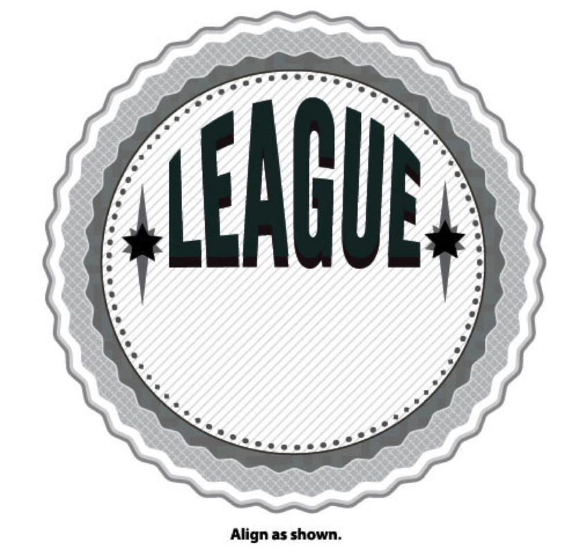
Create A Retro Badge
|
Due Thursday, November 10 at the end of class
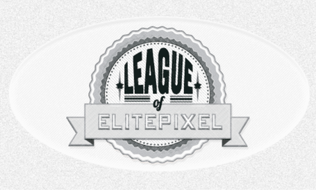
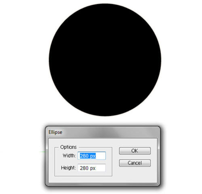
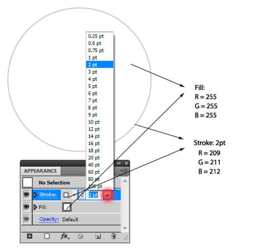
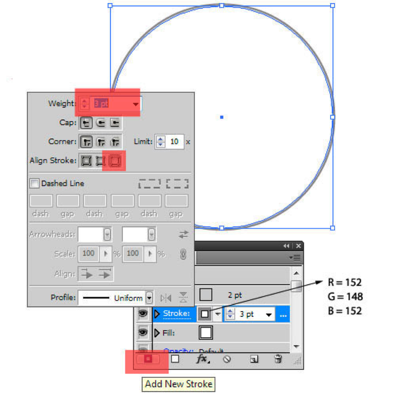
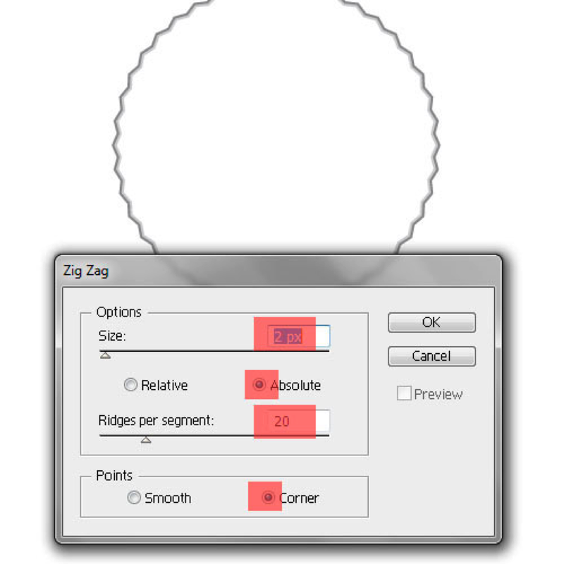
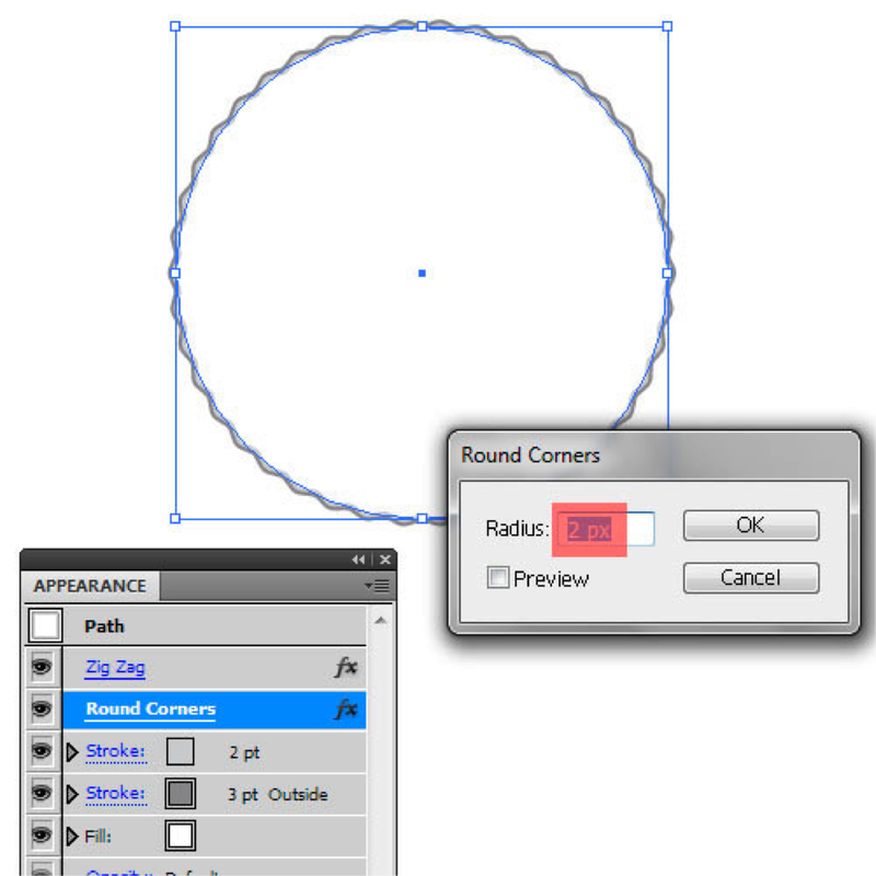
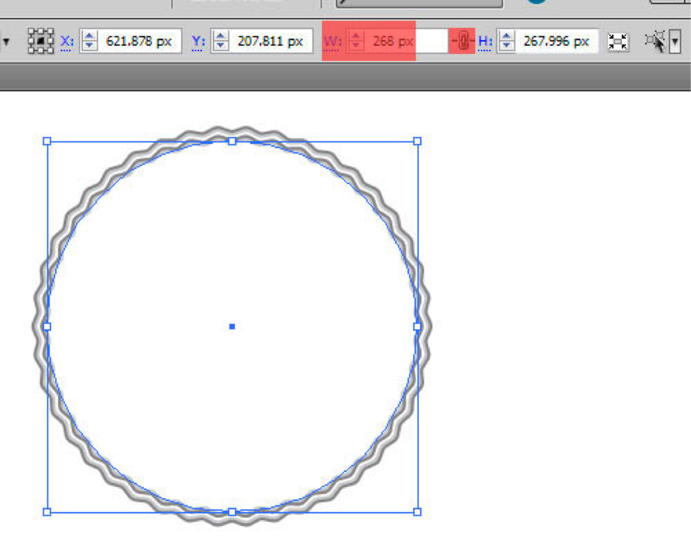
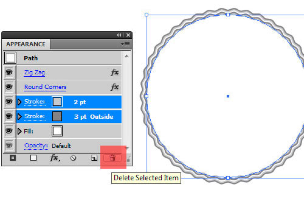
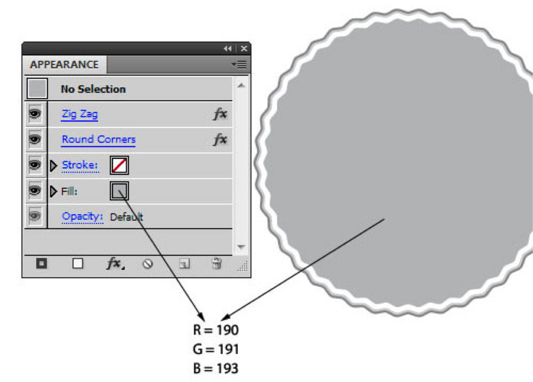
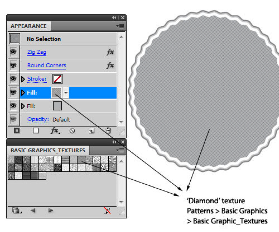
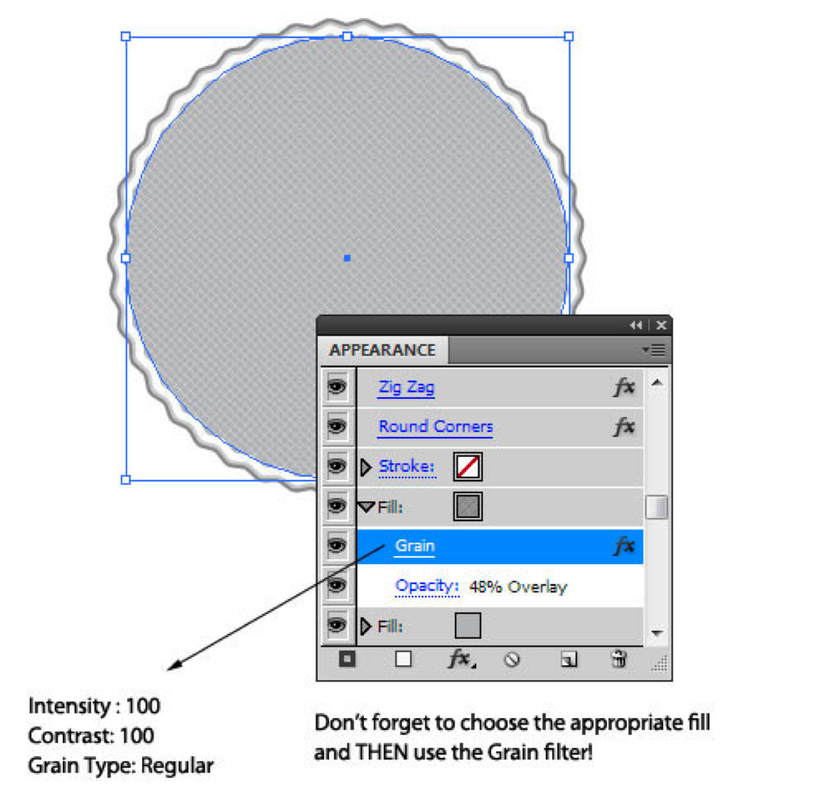
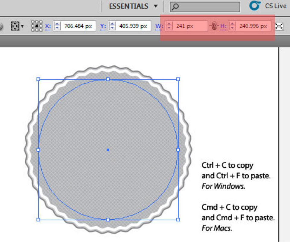
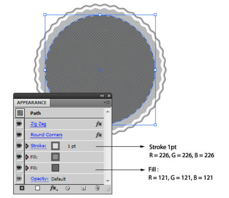
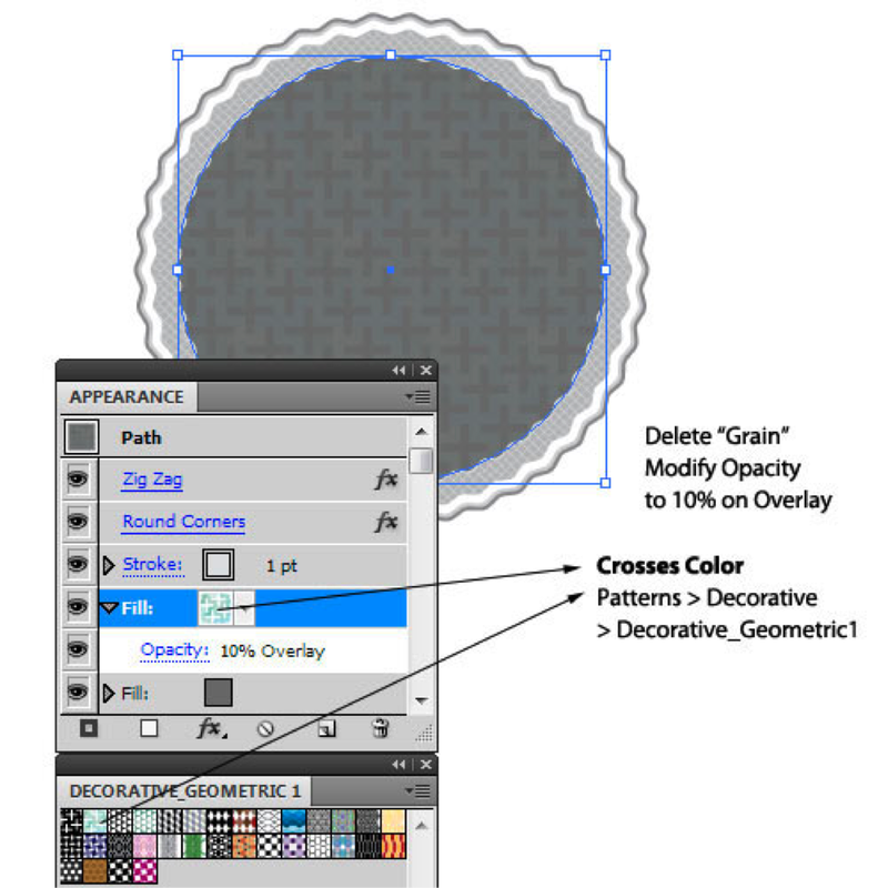
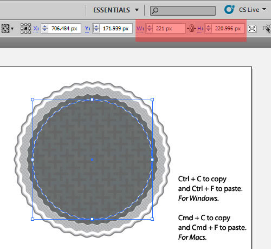
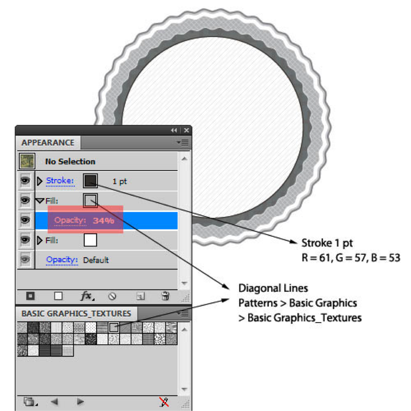
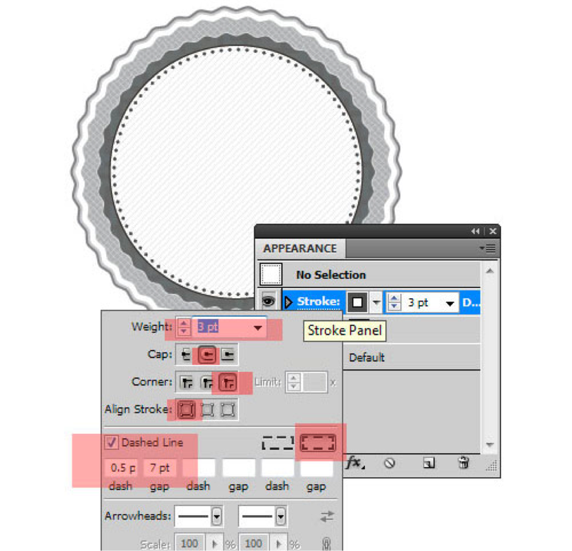
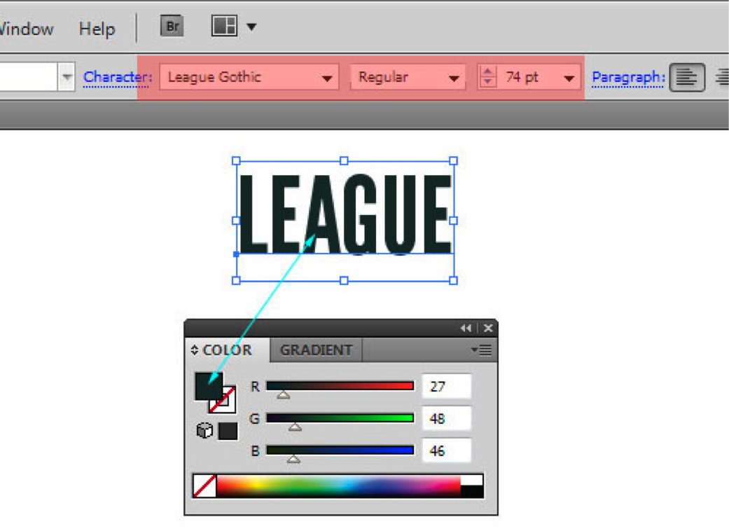
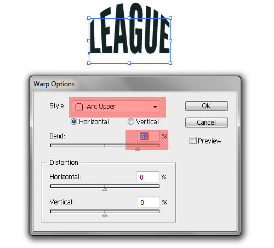
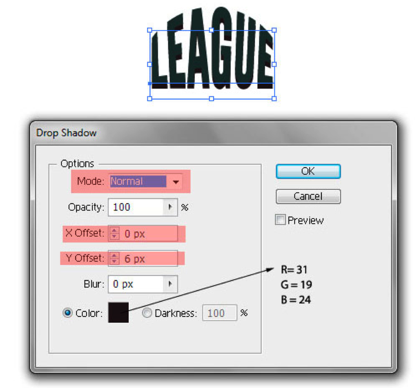
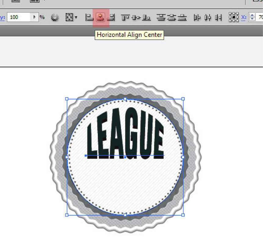
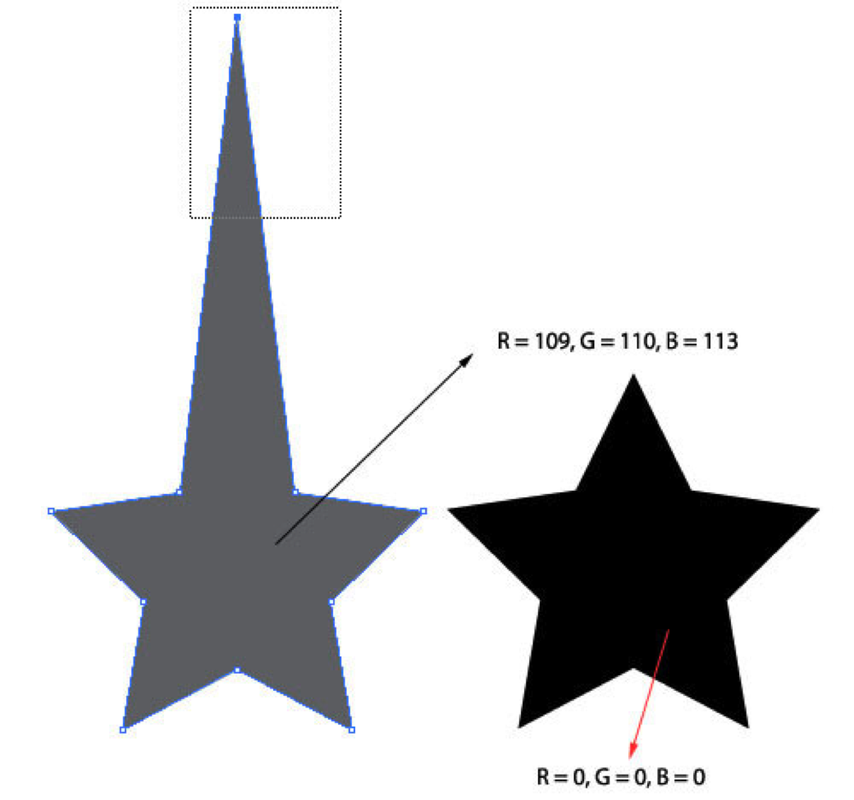
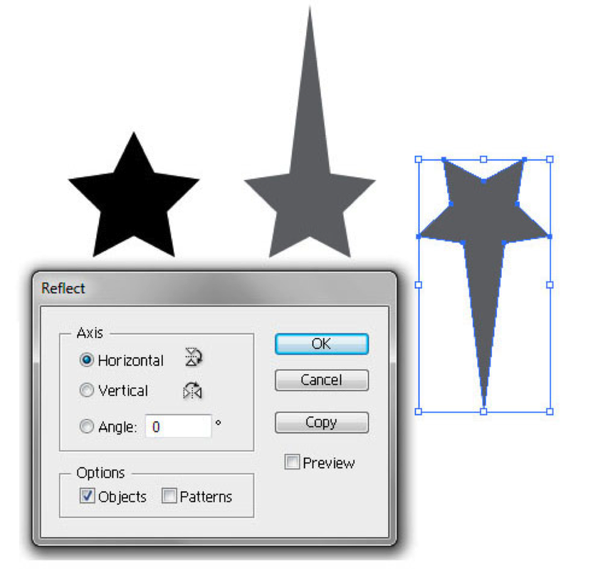
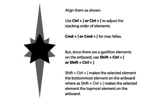
This tutorial will help you create a vector retro badge or emblem. Particularly, in this year, the number of websites using these as attention grabbers is increasing, and it is being touted as a design trend that is not very likely to cease anytime soon. So, it becomes very important as a designer to know how to create these badges. Having these in your arsenal is sure to grab some eyeballs! So what are we waiting for, let’s get started. Step 1 Alright, let’s start off with the usual drill. Create a new document. I have started with an artboard of width and height of 1000px. Also, it helps to have Smart Guides turned on. They are very helpful for aligning elements on the artboard. If you haven’t already enabled them, hit Ctrl + U or go to View > Smart Guides. Now, with the Ellipse Tool,click anywhere on the artboard and in the pop up window, hit 280px in both width and height. Step 2 Now, click on the circle to select it and then change its Fill to white. Since this tutorial will be dealing a lot with different effects and such, it helps to have your Appearance Panel open. Hit Shift + F6 or alternatively, go to Window > Appearance. Add a stroke to the circle and change its weight to 2pt. You can use the Appearance panel to make these changes, as shown in the image. Step 3. With the circle selected, go to the Appearance Panel and hit the first button from the bottom-left to add a new stroke. Click on the word “Stroke” to change its settings. Now add in the values as shown in the image. Make sure that the new stroke is below the previous stroke. If it isn’t then drag it below the previous stroke. Step 4. With the circle selected go to Effect > Distort and Transform > Zig Zag and enter the values as shown in the image to the right. Step 5 Let’s round off the spikes. Again, with the circle selected, go to Effect > Stylize > Round Corners and enter a radius of 2 px. You would have observed in the previous step that there was an option to “Smooth” the points. Yes, that could have been done, but, having manual control on how smooth you want it to be is much better, which you could only achieve with this step. Step 6. Copy the circle by hitting Ctrl + C and paste it in front by hitting Ctrl + F. Now, select the new circle and change its dimensions by using the toolbar on the top (You can view it only after selecting any element.) Also, don’t forget to click on the link so as to make sure that the dimensions are equal and proportional. Step 7 Let’s modify this new new circle. With the Appearance Panel, select both the “Stroke” and delete them using the trash bin icon below as shown in the image. Step 8 Let’s give this new circle a different color. With it being selected, either use the Fill Square from the Tool bar or you can directly change the Fill using the Appearance Panel as shown in the image below. The color values are also given in the image for reference. Step 9 In the Appearance Panel, hit on the “New Fill” button to add a new fill. Also navigate to the Swatch Libraries Menu by clicking on the down pointing arrow next to the fill content (as shown in image). This would bring out a pop out menu. Click on the bottom-left first icon to go to “Swatch Libraries Menu”. From there, choose the “Diamond” texture by going to Patterns > Basic Graphics > Basic Graphic_Textures. Step 10 Now, set this new fill on overlay with 48% opacity. You can do this by clicking on the right pointing arrow next to the word “Fill”. Then with this Fill selected go to Effect > Texture > Grain and set both, Intensity and Contrast to 100. Step 11 Again, copy the circle by hitting Ctrl + C and paste it in front by hitting Ctrl + F. Now, select the new circle and change its dimensions by using the toolbar on the top. Step 12 With the Appearance Panel, add a new stroke to this new circle. Also change the existing bottom fill to values shown in the image. Step 13 Now, click on the texture fill. Let’s modify it. Again, just edit it (don’t add a new fill). Navigate to “Swatch Libraries Menu” as mentioned before. From there, go to Patterns > Decorative > Decorative_Geometric1 and select “Crosses Color”. Change the opacity from 48% to 10% and delete the grain effect. Step 14 Copy the new circle again, paste it, and change the dimensions of the latest circle again by using the toolbar on top. Step 15 Using the Appearance Panel, edit the stroke and the base fill. And yet again edit the texture fill to “Diagonal Lines” from Patterns > Basic Graphics > Basic Graphics_Textures and set the opacity to 34%. Change the “Overlay” to “Normal”. Step 16 Copy and paste the latest circle. Adjust the dimensions so that they are less that the previous circle by a small margin. In the Appearance Panel, delete everything except the “Stroke” and adjust it accordingly as shown in the image. This trick creates a cool “ring of dots”. Step 17 The base of our badge is done, let’s move on to add features to its face. Let’s start off by adding some text. Using the Type Tool (T) click anywhere on the artboard and type in anything that fancies you. I’ve typed in “League”. Adjust the Font, the Font style and the Font size accordingly as shown in the image. Change the Fill, if you wish. Step 18 With the text selected go to Effect > Warp > Arc Upper and set in the values as shown in the image. We are warping the text so that it fits nicely in the circular structure of the badge. This is editable, so even after warping you can easily edit the text. Step 19 Let’s add a good drop shadow to this text so as to make it look 3D. With the text selected, go to Effect > Stylize > Drop Shadow and set in the values as shown in the image. Step 20 Now put this text on the badge and align it as shown in the image. One neat trick by using Shift + Arrow keys to nudge the text by 10px. You can also select both the circle and the text by holding down Shift and clicking on both these elements. Then, using tools on the top, click on “Horizontal Align Center” to horizontally align the text centrally in relation with the circle. Step 21 Let’s move on to add some decorative elements on our badge. Start off by creating a star using Star Tool. Click on the Star Tool and drag out a star onto the Artboard. Hold down Shift to get a proportionate star and use the arrow keys to adjust how many points you wish to have. Duplicate this star (by clicking on it and then dragging it while holding Alt). Using the Direct Selection Tool (A) select the top point of the duplicated star and nudge it using Shift + Up arrow to nudge it in measures on 10px upwards. I’ve nudged it 70px. Step 22 Again duplicate the duplicated star and the turn it upside down by selecting it and going to Object > Transform > Reflect, choose “Horizontal” and click OK. Step 23 Align them as shown (Smart Guides will show you where their commmon centres are). Also you might have to change the stacking order so as to have the original star on top on the other stars. Use Ctrl + [ to push an element down and Ctrl + ] to pull an element up. Step 24 Make two copies of these stars and align them with the badge as shown in the image. Scale them accordingly as you wish. Step 25 Draw some basic rectangular shapes using the Rectangle Tool (M) and make two copies of this. Use the image below for reference. Step 26 Align these to the badge as shown. You will probably have to scale them. But, you can position them wherever you wish, however big you wish. Step 27 Add some extra text. I’ve added “of” with the font “Lobster 1.3″ at 35pt. Also, I’ve applied a basic drop shadow (Effect > Stylize > Drop Shadow). Place them between the rectangles we made, Use the image for reference. Step28 Using the Pen Tool (P) and Rectangle Tool (M) draw some shapes as shown in the image below. For now, set their stroke to black and fill to white. Step 29 Graphic Styles in my opinion is the best feature in Illustrator. You can apply a set of styles to any shape, path or text which also remains editable. Like Layer Styles in Photoshop, but, better and more flexible. Now, let’s create two graphic styles that we will apply to our shapes later. So, start off with any shape and modify its Fill and Stroke as shown in the image. Step 30 Add a new fill to this shape and again navigate to “Swatch Libraries Menu” and go to Patterns > Basic Graphics > Basic Graphics_Textures and select “Diamond”. Set this fill on overlay. Step 31 Let’s add some drop shadows to give it a 3D effect. So, select the shape and go to Effect > Stylize > Drop Shadow and hit in the following values. Step 32 We’ll give it another drop shadow, so in the appearance panel, duplicate the Drop Shadow and edit it and just edit the color as shown in the image. Make sure that this drop shadow is below the previous drop shadow. Step 33 Now open up your Graphic Styles Panel by going to Window > Graphic Styles or you can alternatively hit Shift + F5. Select the shape again, and click on the “New Graphic Style” button on the Graphic Styles Panel. Voila! There you have it, you can then apply this Graphic Style to any other shape/path/text. Step 34 Now, onto our second graphic style. It is pretty similar, just delete the texture fill and change the base fill’s color to white. Then again add this to the Graphic Styles Panel. Step 35 Apply the first Graphic Style to the ribbon shapes we made. Don’t apply it to the two mini triangles, just change their fill and delete their stroke. Now align all those shapes as shown in the image below. Step 36 Align the ribbon onto the badge as shown in the image below. To move around the whole ribbon and not just any single shape, just select all the elements of the ribbon and group them by hitting Ctrl + G. Also don’t forget to change the stacking order of “of” so that it appears above the ribbon. Step 37 Add text, I’ve used “ChunkFive” font here (I’ve used “Liberator” font in the final image.) Now, select the text and apply the second graphic style to this text. Align it over the ribbon as shown. We’re done! or are we? Step 38 Not yet! Let’s add a finishing touch to the badge (which is not exactly needed). Import the badge over to Photoshop as a Vector Smart Object and then duplicate it. Select the top layer and go to Filter > Artistic > Colored Pencil and play around with the settings. Then, set this top layer on overlay and reduce the opacity to your need. And we’re done! |
|
PictogramsDue: Wednesday, October 12, at end of class
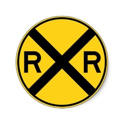
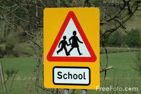
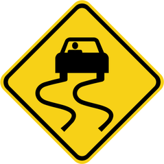
Objectives: Approach a problem from a unique perspective. Streamline a complex storyline into a simple, clear visual narrative. Improve your drawing skills with Adobe Illustrator. Draw simply but well. Consider the design of the whole page. Pictograms Graphic stylized symbols Visual symbols that give information Pictures without words Graphic symbols that tell a story in a simple way A way to communicate messages without words Universal, visual, wordless language This kind of symbol surround us in our daily lives.: on the street in supermarkets in department stores in public buildings on roads show us where to find telephones restrooms train stations airports restaurants examples: •Caution: Rail Rodad Crossing •Slow!: School Crossing •Caution: Slippery When Wet Project: Create a pictogram that conveys the essential storyline of a famous book or movie, in a simple, clear, FUN and easy-to-understand way. |
|
COPYRIGHT
|
Due Monday, September 12 @ 11:59pm
Download the document "Copyright Basics" located to the right. Read these 3 sections: What Is Copyright? Who Can Claim Copyright? What Works Are Protected? |
| ||
Benedict.com provides a lot of useful information regarding copyright, patent and trademark rules and regulations. This page also offers stories of documented copyright infringement disputes. The stories are divided into three (3) main categories: movies, music and web.
ASSIGNMENT:
ASSIGNMENT:
- Go to http://www.benedict.com.
- Move your mouse to the web section, and choose "Process More". Explore the disputes in the WEB section and choose two (2) cases to write about from the left hand column of the website (Batman, Devil's Advocate, 12 Monkeys etc..
- Open Google Docs
- Title your document “Copyright Cases” and IN YOUR OWN WORDS, give a brief account (Summary) of the two (2) cases you have chosen. 3 paragraphs for each case as a minimum.
- Include in your Summary: The parties involved, what they are arguing about and who won the case. If the case is still in court, state that the outcome is pending.
- Download at least two (2) images per story from the Internet to illustrate your stories.
- If you search for “Free Use” or “Royalty Free” images, many sites will come up. It is OK if the images you choose have watermarks.
- You may use Photoshop to edit each of your images but it is not required.
- Insert the pictures into your stories. (In Word: Insert > Photo > Picture From File).
- You may resize the photos once you insert them into Microsoft Word.
- When finished, Save and share your document. Please include your name and period number at the top of the document
JARRETT KROSOCZKA REFLECTION
Due at the end of the period
View the video below:
Once you view it, write a reflection about what you find inspiring about his story.
Relate it to some creative aspect of your life, and describe how it applies to you.
1. What were the obstacles that Jarrett encountered as a young child?
2. What people in his life were helpful and kind to Jarrett and how did they make a difference in his life?
3. How did his passion for art help him throughout his life?
4. What is your overall impression of this artist and his story?
Remember that our reading skill for the month is , so be descriptive in your witing. I need well written sentences and well thought out answers.
JarrettJKrosoczka_2012X-480p from steve exum on Vimeo.
DIGITAL SCAVENGER HUNT 1
DUE SUNDAY, AUGUST 28, 2014
Take the words from the word list below, and make a powerpoint/Google Slides presentation. One word per slide. Find the most outrageous photo to use as an example of the word.
DO NOT USE THE STANDARD TEMPLATES FROM THE PROGRAM. BUILD YOUR OWN MASTER SLIDE!!!!!!!!!!!
You must include your sources! You can make a references section in the back, or include it on each slide as in the example.
This project is about perception, creative thinking and digital media use. Be inspired to show the world through your eyes.
1. Site the definition for each of the words.
2. Find a picture that expresses the essence or the spirit of the word.
REMEMBER- Don’t stop at your first idea. Find the most eccentric way out example of the word. Be creative, use the definition to help you find the most expressive picture you can find…..and have fun with it.
EXAMPLE
proximity [prok-sim-i-tee]
noun
1. nearness in place, time, order, occurrence, or relation.
Although his presence was sporadic and invisible, just the thought of hisproximity delighted and intimidated me.
Show me a picture that exemplifies this definition. Keeping with the context of graphic design.
Use the word list below
WORD LIST:
BUTTONS
RED
SQUARE
CLUTTER
UNDERNEATH
CAN'T LIVE WITHOUT
STRIPES
CURVY LINES
SOUND
EMPTY
DELICIOUS
UPSIDE DOWN
SILENCE
WATER
PATTERN
TOGETHER
PUSH
DEVELOP
PASSION
OCCUPATIONS PRESENTATION
Due Sunday August 14th, 2016 by 11:59pm
SPECIFICATIONS
Length: Your PowerPoint must be a Minimum of 20 slides.
Text: Your Title slides must be easy to read:
Tips: Choose fonts that are clear and simple. Choose good color contrast. Must be able to be read from across the room when being presented (don’t use too small of a type size.) Don’t use too busy of a background.
Creativity: Remember that completing the minimal project requirements will earn C work. Adding more information, pictures, descriptions/explanations etc that are relevant and serve to a better understanding for the audience will earn the higher grades. So push past your first attempt, and dig deeper for the more interesting pictures, or the more intriguing facts. You want to visually communicate what the job is all about. This also is your first "design" project, so give it your best shot at being aesthetically pleasing.
TIPS:
1. Don't use too many font families or styles. Two fonts are usually enough, but you decide what looks best.
2. Don't have too many facts on a slide. We need to see it from across the room when presented. It is OK to have more than the required number of slides. When you have paragraphs of info on one slide, the text gets too small. Generally speaking, you want to have just one thought per slide.
3. If you put text or headlines over a photo, make sure the text is still readable. You shouldn't have to strain to read it. If you do, you will lose your audience.
4. When getting the content for this project, don't plagiarize!
DOCUMENT YOUR SOURCES
DO NOT COPY AND PASTE FROM ANY SOURCE. THIS IS IN YOUR OWN WORDS!!!!!
Use this as a check list as you progress through the completion of the project. This is just as much a design project as it is a written assignment. How it looks is as important as what it says. It is all part of the story you are telling.
SLIDE CRITERIA:
Slide 1- Title Slide
Must include: Occupation name, Your name, Period # and Fall 2015
Use a background image that will be relevant to your topic.
Slide 2-3 Skill Set
Must Include: Job Skills Needed: Minimum of 6.
“Describe” what the skills are. Don’t just make a list that doesn’t communicate anything.
Slides 4-6 Work Station
Must Include: Photos of Typical Workdesks or Workstations or workplace
2 or 3 Important Facts per slide describing it.
Slides 7 - 8 Compensation
Must Include: Salary statistics for the Occupation
Must have the National; Regional; and Local statistics
Slide 9 - 10 Descriptions
Must describe in detail What They Do
Show examples of what the work looks like
Slide 11 - 13 Training, Qualifications, and Advancement
What formal training/education is required for entry into this occupation.
Are there degrees, certificates etc? Name a few colleges or universities that have the degree you would need.
Slide 14 Professional Organizations
List the Professional Organizations/Associations affiliated with this occupation (Unions etc)
Give a short description of each, explain their purpose
Slide 15-17 Favorite Person
Choose your favorite or a famous person from this occupation:
Include Name, birth date, his/her contribution to this occupation or the industry as a whole, and why you chose him/her
Slide 18 – 19 Your interpretation-
Why did you choose this Occupation?
What are your final impressions about this Occupation?
What impressed or stood out to you the most about this occupation while doing your research?
Slide 20-21
Your Reflection.
Slide 20+ References:
Include the website URL for each of the facts that you used in the project. You must site your work, or it will be considered plagiarism.
Google Account Set up
Due, @ 11:59pm Sunday, July 24th, 2016
Send me an unbelievably inspirational quote from your google account. Be sure it is an account with your name in it. I wont know who [email protected] is.
This must be a gmail account, not yahoo, hotmail or anything else, just gmail.
Send me an unbelievably inspirational quote from your google account. Be sure it is an account with your name in it. I wont know who [email protected] is.
This must be a gmail account, not yahoo, hotmail or anything else, just gmail.
Materials You will need for class
|
Due August 1st, 2016
Sketchbook Due July 25th, 2016 |
| ||
Submit Forms
|
Expectation Contract
Internet Use Contract Graphic Design Syllabus Due August 1st, 2016 Download it from the docs to the right, print it out, and have both you and your parents sign it, then turn it in on or before August 1st, 2016 |
| ||||||
Donated Items List
List of Items to Donate
Tissue Box
Disinfectant Wipes
Hand Sanitizer
Paper
Towels
UHU Glue Sticks (jumbo/Large)
Scotch Tape
Tissue Box
Disinfectant Wipes
Hand Sanitizer
Paper
Towels
UHU Glue Sticks (jumbo/Large)
Scotch Tape

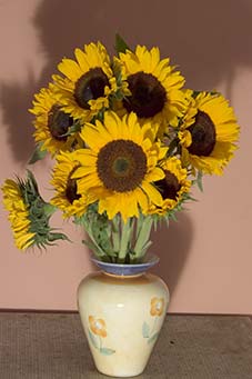
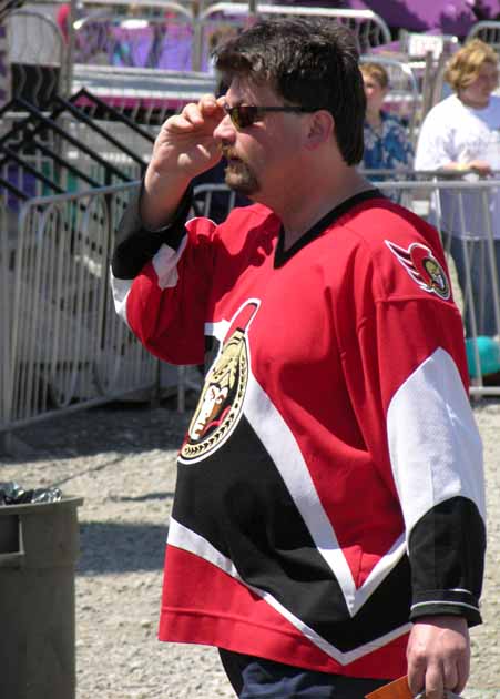
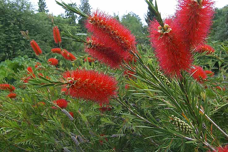